A “What If Wednesday” Post

In previous posts we discussed two other architects and designers who practiced modernism. Alvar Aalto, is another modernist, who was from Finland. While being an architect, he also designed furniture, some of which inspired the furniture you see in Scandaniavian furniture stores today, including IKEA.
Alvar Aalto was a contemporary of Frank Lloyd Wright and Mies van der Rohe, but unlike them, Alvar used curved lines and shapes rather than horizontal or straight lines. Also, unlike the other two, he had a degree in architecture from a college (Matthews 2010). However, like, Frank Lloyd Wright, his architecture was influenced by the Japanese culture and style (Rincon-Borrego and Rodriguez-Llera 2022).
Alvar Aalto started out with the Nordic Classicism approach, noted in the Paimio tuberculosis sanatorium and the Viipuri library (Norvasuo 2016), but over time he migrated to the more modern International style (Time Magazine 1959) with a humansitic approach. He was also instrumental in Finnish community planning (Norvasuo 2016).
In regards to furniture, Alvar Aalto became the first designer to use a cantilever in wooden chair designs and held a patent in the same (Candidate and Fleming 2019). Examples are his Paimio Chair and Armchair 400. His same concept is seen today with the popular Poang Chair from IKEA. Most of Alvar’s furniture is sold through the Artek company (Hipeli 2012), which still exists to this day. Note, Mies van der Rohe, also created a similar cantilevered chair, but in metal.
Alvar Aalto also designed lamps, for which he used in the design of his buildings (Hipeli 2012).
Automattic, the makers of WordPress, developed a theme in honor of Alvar Aalto and his two wives Aino and Elissa, called the Paimio theme. This theme has an image of the Paimio chair that was designed as part of Alvar’s work on the Paimio Sanitarium and was an effort to make it easier for tuberculosis patients to breathe. However, this chair is also comfortable for those without tuberculosis, making them popular.
The Basics of an Alvar Aalto Website
An Alvar Aalto designed or inspired website would prioritize user experience and harmony with some organic elements. Some of the visuals and features of the hypothetical website are below.
- Website Visuals
- Natural Color Palette: Similar to Frank Lloyd Wright, Alvar Aalto would use earthy colors such as light browns, beiges, and whites, and organic colors such as blues and greens.
- Organic Shapes: Unlike Frank Lloyd Wright, Alvar Aalto would use subtle curves and rounded edges to resemble those found in lifeforms. Unnatural geometric shapes such as right angles, not found in nature, would not be used.
- High-quality Photos: Images would have clear presentaton and have good composition.
- Website Visuals
- Functional Minimalism: Only include necessary website elements and concentrate on the core purpose of each component. This means the website would have easy navigation, clear menus with unclutterd layouts, and a reduction in superfluous decoration. These principles reflect Aalto’s belief in the need for functionality.
- Emphasizes User Experience: An Alvar Aalto website would prioritize a smooth and enjoyable browsing experience and have a clear call to action.
- Human Touch: The website would have subtle textures of nature including wood grains and natural fibers, giving warmth.
- Would Focus on Content: Website content would be well-written with legible fonts to prioritize user understanding.
- Integration of Multimedia: The website would have integration of curated videos and interactive content that would showcase content without overwhelming the user.
Use of a Natural Color Palette in an Alvar Aalto Website
Alvar Aalto architecture promoted the connection between humanity and nature. Using natural colors helps improve user engagement, brings more emotional response from familiar colors, and builds a stronger brand identity. Most of Aalto’s influence in design was the result of marrying the natural world to humanity.
- Base Colors that Reflect the Earthy Natural World: These colors would incorporate the colors and textures of the materials that Alvar Aalto was known for.
- Light Browns: The color of the wood that Aalto worked with. Examples include taupe, beige, or oatmeal.
- Beiges: Gives a sense of warmth and neutrality. Examples include eggshell, ivory, or wheat.
- Whites: Provides clean lines and spaciousness. For an Alvar Aalto inspired site off-whites or whites with warmth such as soft-white would be used.
- Accent Colors: These add subtle pops of color and visual interest.
- Blues: stands in for the atmospheric elements such as water and sky near Aalto’s buildings.
- Examples could include dusty blue, pale caerulean, oceanic teals, and denim blue.
- Greens: Stands for Aalto’s connection to nature.
- Examples include sage green, olive green, lush greens, and seafoam green.
- Contextual Colors: If your website is geographically focused, try to use colors that resemble and reflect the local flora, fauna, and landscape. This can bring cultural and geographic relevance and is emblematic of Aalto’s local community involvement.
- Seasonal Variation: If your website changes a lot, try to have colors that reflect the current season. These colors can also be used in short-duration landing pages.
- Blues: stands in for the atmospheric elements such as water and sky near Aalto’s buildings.
- Color Balance: An Alvar Aalto website should not be overwhelmed with color. Alvar would use the 60-30-10 rule:
- 60% – Base Color (most dominant)
- 30% – Secondary Color (complementary to the base)
- 10% – Accent Color (adds a pop of contrast)
- Include Gradual Transitions: Gradual transitions mimic the atmospheric phenomena in nature. An example would be the dawn’s early glow, twilight, or the grays and blues of storm clouds.
- Material Textures: Aalto was known for his use of natural materials such as wood, brick, and copper (Time Magazine 1959). These could include:
- faint wood grain patterns
- linen and fabric textures
- clay and stone
- timber
The Use of Organic Shapes

Alvar Aalto incorporated organic shapes into his designs and architecture, largely deriving from his experience in working with curved wood (Candidate and Fleming 2019). A website designed by him would exhibit the fluid, freeform contours resembling the objects found in nature, such as curves and rounded corners. Alato stated that “variety and growth reminiscent of natural organic life are the very essence of architecture” (Weinstein 2008). Below are some tips on how to achieve this in a website.
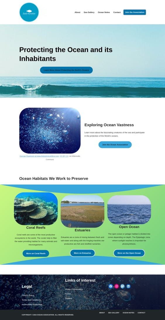
- Include Subtle Curves and Rounded Edges: Use softened corners and gentle curves on elements such as buttons, image containers, section dividers, and background shapes. These could evoke the flowing lines of a riverbank, waves, pebbles, or the gentle slope of a hill, as was used with the Viipuri library (Jurado 2016).
- Asymmetrical Layouts: Use asymmetrical layouts for sections and elements. This would more accurately reflect the natural world where perfect symmetry is rare or of how rock formations are perfectly mirrored. Often the main room of his buildings would mirror the surrounding landscape (Andresen 2011).
- Organic Inspiration in Details: Try to evoke natural forms.
- Use soft gradients in backgrounds to mimic a sunrise or sunset.
- Have a subtle wave patterns as borders.
- Include leaf and flower-like shapes as decorative elements.
- Balance the Organic Shapes with Functionality:
- Don’t let the organic shapes become so complex that they hinder navigation or readability.
- Ensure the elements used as clear, functional, and serve a purpose.
- Be sure to use plenty of whitespace to allow the elements to breathe.
- Match the Typography to the Organic Shapes: Try to use fonts that have curved letterforms or handwritten styles. These may include sand-serif font families. However, make sure that they are readable and clear with generous letter spacing, optimal heights, and moderate stroke weights. Font counts and sizes should be minimized to reduce cognitive load.
Application of organic Shapes in a website

- Curvilinear Navigation Menus: Use rounded or undulating outlines to house menu items instead or rectangular dropdown menus. Having smooth borders and transitions imitate Aalto’s signature curving facades.
- Use Freeform Page Layouts: Divide pages using wavy separators, cloudlike blobs, or other abstract partitions. This can help add depth, interest, and energy to the composition.
- Use Irregular Background Textures: Try to use organic backgrounds patterns such as scattered pebbles, woodgrains, or brushstrokes. Have imperfect backdrops to foster relatability and intimacy and look more like that which is found in nature.
- Use Soft Buttons and Input Fields: Instead of angular buttons, try to use oblique, oval, or circular variations that have gentle shadows and gradients. Rounder interfaces are friendlier and more approachable leading to more engagement.
- Use Asymmetric Balance: Distribute elements unvenly around a central focal point to mimic the controlled chaos of nature.
Using High-Quality Visuals
When using images on an Alvar Aalto website, use those reflecting the natural world. These photos could include landscapes, forests, bodies of water, and natural materials like wood and stone. Aim to use a minimum of photo post-processing to keep them as natural as possible. Make sure the colors in the photos match those in the website.
Functional Minimalism
In the previous posts with Frank Lloyd Wright and Mies van der Rohe, we talked about “Form follows Function.” Alvar Aalto, essentially reverses this, and concentrates more on the function following form. A website following functional minimalism exude elegance, while prioritizing efficiency, and ease-of-use. As a result a lasting impression is made.
Central Tenets of a Functional Minimalism Website
- The User Exprience is Job One: Website clarity and intuitiveness fall above all else. Every element should serve a defined purpose and assist users in accomplishing tasks and getting information effeciently. Decision fatigue reduction leads to trust and loyalty among users.
- Mind the Whitespace: Focus on having plenty of whitespace to allow elements to breathe, thereby reducing clutter. Balanced whitespace adds refinement and reflects Alvar Aalto’s preference for restraint over excess.
- Have a Visual Hierarchy: Distinguish levels of importance through scale, weight, and positioning. Have a logical order, i.e. heading structure, that guides user sequentially.
- Simplified Iconography: Use universally understood symbols that are devoid of distracting details to aid in comprehension.
- Mobile-responsiveness: Be able to accommodate the device that the reader is using, echoing Aalto’s need for adaptability.
Focus on User Experience
As stated in the last section, user experience is job one with an Alvar Aalto inspired website. A central tenet of Aalto’s designs were the comfort of the people using them and paying attention to every detail. Make sure that your website provides a positive experience and by attending to the finer details of the website, you can meet this tenet as well. Below are some ways to emphasize user experience in a way that Alvar would be proud of.
- Content and Functionality of the Website
- Focus on User Needs: Understand your target audience and their needs when visiting the website. Ask, what are they looking for and what actions do you want them to take?
- Have Clear Calls to Action: Make your call to action visually distinct and easy to understand.
- Accessibility: Ensure that your website meets the Web Content Accessibility Guidelines (WCAG). Alvar Aalto designed his chairs to be comfortable for tuberculosis patients and make it easier for them to breathe. As a result, he designed chairs that were comfortable for everyone.
- Usability and Design
- Have Minimal Clutter: Do not have excessive information in the website and provide clarity of purpose with what you have.
- Have a Fast Loading Time: Nobody likes to wait. A fast loading website ensures a smooth and enjoyable experience.
- Have Predictable and Intuitive Interactions: Do not make users guess how to perform and action. Make sure that they know what to do and how to do it.
Having a human touch to your website
Alvar Aalto, in his designs and architecture, always tried to create a sense of warmth and approachability. This was part of his human-centered approach and can help in addressing your readers pain points. Adding the elements below can help in making a website that is more than a digital brochure and can be achieved by:
- Content and Tone:
- Friendly and Approachable Language: When writing the website content, avoid using jargon or formal language by using conversational and friendly tones feel like you are talking directly to the user.
- Storytelling: People like to be told a story. Stories of how your products or services have impacted others can be told through text, videos, and interactive elements.
- Use Personal Anecdotes: To about your own experience to make your content relatable.
- Visual and Interactions:
- High-quality Human Photos: Showcase people utilizing your products and services.
- User-generated Content (UGC): Add photos or testimonials of people who have interacted with your site. This can add a sense of community and real-world connection.
- Have Subtle Animations: Include hover effects on buttons, smooth scrolling transitions, or small visual cues that acknowledge user actions. Play with light and shadow effects to create depth and guide the reader’s eye to the important elements.
Focus on Content and Typography
An Alvar Aalto inspired website would have have well-written content with fonts that were common during his career. These fonts would include Futura, Akzidenz Grotesk, or Helvetica. Make sure the typography is easily readable in lighting conditions, screen sizes, resolutions, and reading distances.
Example Website Design Using Alvar Alto Principles

Conclusion
Alvar Aalto is a contrast to Frank Lloyd Wright in that he used curved lines instead of straight lines, and of Mies van der Rohe who brought the inside outside. Alvar sought to mimic the life around his buildings and add a familiar human touch, which focused on the user experience of the architecture. A website inspired by Alvar Aalto should focus on user experience as the ultimate purpose.
References
- Andresen, Brit. 2011. Alvar Aalto and Jorn Utzon: An Architecture of Ancient Gathering Forms. UME 22: 44-59.
- Candidate, Mihoko Ando and Patrick H. Fleming. 2019. Journal of Design History 32 (2):
- Hipeli, Mia. 2012. Artek and Alvar Aalto. Docomomo 46: 37-41.
- Jurado, Josemaria Manzano. 2016. The Abstract, Aalto and Drawing. Revista de EGA 21 (27): 106-113.
- Matthews, Henry. 2010. Review of Alvar Aalto: Architecture, Modernity, and Geopolitics by Eeva-Lisa Pelkonen. Architecture and Design 17 (1): 60-61.
- Norvasuo, Markku. 2016. Alvar Aalto and the industrial origins of Finnish 1940’s community planning. Planning Perspectives 31 (2): 227-251.
- Rincon-Borrego, Ivan and Ramon Rodriguez-Llera. 2022. Nordic Memories of the East. Tetsuro Yoshida and the myth of traditional Japanese house in Erik Gunnar Asplund, Aino Aalto and Alvar Aalto. VLC Arquitectura 9 (1): 27-48.
- Time Magazine. 1959. Prickly Individualist: Finland’s Aalto. Time 74 (14).
- Weinstein, Norman. 2008. Alvar Aalto Through the Eyes of Shigeru Ban. Architectural Record 196(2).


