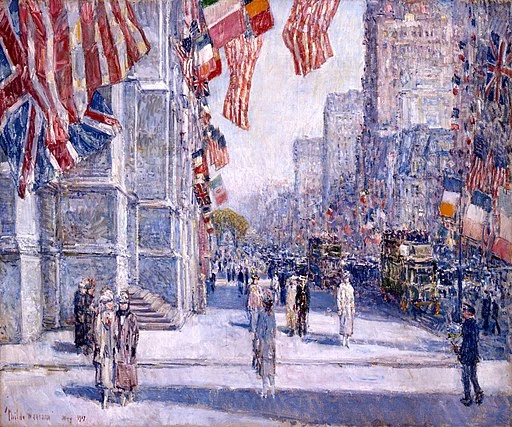
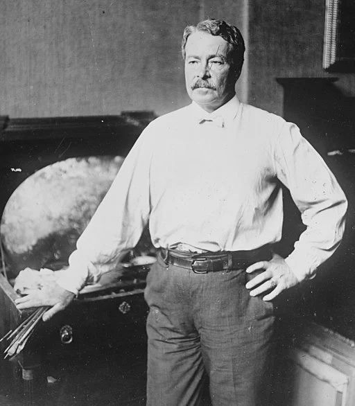
Childe Hassam (1859-1935) was an American Impressionist counterpart to Claude Monet, who was from Boston, Massachusetts and was considered to be a pioneer in American Impressionism (Weinberg 2004). Hassam created vibrant scenes using loose brushstrokes that emphasized light and color and his early work was influenced by J.M.W. Turner, an English landscapist and watercolorist (May 1990). His paintings generally depicted landscapes, urban scenes, and flowers and similar to Monet he practiced plein air painting (Bullock 2004). Locations that he painted included New York City and the northeastern United States, particularly the Isles of Shoals, Europe, and Oregon.
A “What if Wednesday” Post

Some of Childe Hassam’s most famous paintings were produced on Appledore Island, Maine. At the time the island was the site of an artists colony, hosted by Celia Thaxter, a writer and poet. Celia Thaxter had a garden, which was the subject of a lot of his paintings, similar to Monet and his garden at Giverny. Additionally, Childe Hassam used the island as a place to experiment with color and atmosphere (HistoryNet 2016) and going there over the course of three decades (Bailly 2017). When Celia Thaxter’s residence and garden were destroyed by fire in 1914, Childe Hassam’s paintings were used to reconstruct the site.

While in Paris, France, during the late 1890s, Childe Hassam, rented a studio that was once occupied by Pierre-Auguste Renoir (Stewart 2004). Hassam found some of the paintings abandoned by Renoir and saw that his style was what he was trying to do. While in France, Hassam learned impressionism skills that he brought back to America (Time 1965).
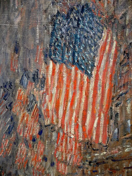
In the early 1900s, Childe Hassam did paintings of US flags that were hung in New York City during World War I. One of these paintings hung in the Oval Office of the White House during the Presidency of Barack Obama. Besides painting, Hassam also did prints in charcoal and crayon (Reynard 1960). Later in life, in 1920, he received the Gold Medal of Honor award from the Pennsylvania Academy of Fine Arts.
A website inspired by Childe Hassam would be appropriate for varied subjects such as art, culture, history, and technology. Prominent features could include cityscapes, rural vistas, interiors, and still lifes.
The Basics of a Childe Hassam Website
A Childe Hassam website would have a sense of optimism, warmth, and the appreciation of the beauty of everyday life. Below are some characteristics of a website designed or inspired by Hassam.
- Website Visuals
- Color Palette: A vibrant yet harminous palette reflecting Hassam’s use of light and color such as:
- Sun-drenched tones: Light yellows, warm oranges, and soft pinks that represent the sunlight in his paintings.
- Cool Accents: Touches of cool blues and greens to represent shady areas, foliage, and the ocean around the Isle of Shoals.
- Muted Backgrounds: Cream or light beige backgrounds to allow the content and images to stand out.
- Typography: The website would have elegant and legible fonts that have a classic feel and reflect the Arts & Crafts movement that influenced Hassam. Some examples are:
- Serif Fonts: Fonts like Garamond or Playfair Display for headings and body text.
- Decorative Script Fonts: Decorative script can be used for short titles or emphasis.
- Color Palette: A vibrant yet harminous palette reflecting Hassam’s use of light and color such as:
- Website Imagery:
- Impressionistic Cityscapes: Ample street scenes that evoke his New York City paintings.
- Luminous Landscapes: Rolling hills, flower filled gardens, and sunlit coastlines.
- Flag-waving Patriotism: Images similar to those of his World War I paintings featuring American flags.
- Artworks by Childe Hassam: Some of Hassam’s artwork could be used in the website in honor of him.
- Website Layout and Functionality:
- Clean and Uncluttered: A clear layout with ample whitespace would reflect the simplicity of Hassam’s compositions. Content could be based on the way Hassam structured his compositions by balancing open spaces with densely packed areas.
- Grid System: A subtle grid system for organization and balance of website elements.
- Subtle Animations: Soft animations and hover effects that add a touch of action without being a distraction. These animations could imitate the appearance of brushstrokes sweeping over the canvas giving the website a sense of depth.
- Responsive Design: The website should adapt to different screens.
The Color Palette in a Childe Hassam Website
Hassam, like a lot of other impressionists, tried to capture the interplay between light and color in his style, much like Claude Monet did with his haystacks. A color palette for a Childe Hassam website could include the following:
- Primary Color Used:
- Sun-drenced tones:
- Light Yellow: Evokes the warm glow of sunlight, which was a prominent feature of Hassam’s paintings. Yellow should be used for backgrounds, buttons, and accents.
- Warm Orange: Represents vibrancy and energy, and is reminiscent of cityscapes that are bathed in sunlight. Orange can be used for highlights and call-to-action buttons.
- Soft Pink: Reflects the delicate lighting in his landscape paintings and adds sweetness and warmth. Pinks can be used for text and decortative elements.
- The Use of Vibrant Primary Colors: Hassam also used vibrant reds and blues to bring out details in his paintings. Vibrant colors can be used for prominent graphic elements that want to be spotlighted.
- Sun-drenced tones:
- Secondary Colors:
- Cool Accents:
- Light Blue: Blues are used for clear skies and shady areas in Childe Hassam’s paintings. Shades of blue give a balance against the warm tones used in the primary colors. Blues should be used for navigation elements and background accents.
- Soft Greens: Greens represent the foliage in Hassam’s landscapes and give a freshness to the site. Greens can be used for borders or text.
- Deep Earth Tones: In this garden and landscape paintings, Childe Hassam used earthy colors such as deep brown, burnt sienna, ochres, and olive greens. These colors along with the ligh backgrounds, help to ground the brighter elements into a cohesive whole. Earthen colors can be used in sidebars, footers, and borders.
- Gentle Pastel Colors: Pastel colors can add a nuanced contrast and add interest and sophistication. They should be used to sparingly so as not overwhelm the stronger primary and earth tones and serve to complement the overall design.
- Cool Accents:
- Backgrounds:
- Muted Backgrounds: Neutral colors like cream and light beige allow the content and images to take center stage while giving a sense of spaciousness. The neutral colors represent the simplicity of Hassam’s paintings, capture the essence of the scene, and do not distract from the content being presented.
Considerations for Website Colors
When using the suggestions above there are a number of things to keep in mind.
- Regional and Topical Influences: Have variations in the color palette depending on the subject of the website. An example, using Hassam’s flag paintings, would have deeper blues giving a patriotic feel during World War I in the early 1900s.
- Color Harmony: Try to use color palette generators to ensure that the colors chosen create a harmonious and visually pleasing experience.
- Accessibility: Whatver the palette chosen, be sure that the color contrast between the elements meets the Web Content Accessibility Guidelines (WCAG).
Example Color Palettes

Do not know how or where to start? Below are some example palettes for inspiration.
- Light and Breezy: A light yellow background, soft pink text, and light blue accents.
- Vibrant Cityscape: Warm orange background, light yellow text, and soft green accents.
- Luminous Landscape: Cream background, soft green text, and light blue accents.
Typography for a Childe Hassam Inspired Website
In any website, typography plays a crucial role in establishing the overall aesthetic. For a site inpired by Childe Hassam, the focus should be on elegance, readability, and a touch of artistic flair. Fonts seleted should reflect the influence of the Arts & Crafts movement and the turn-of-the-century aesthetics during which Hassam created his work.
Different fonts can be used for each section, but use no more than 2-3 fonts in order to provide a cohesive look. Some guidelines for fonts are below:
- Use Serif Fonts as the Foundation: These fonts, having decorative flourishes, add a touch of sophistication and enhance readability, especially when used for body text. Some examples include:
- Garamond: A classic serif font, having a timeless quality and good legibility making it a good choice for body text.
- Playfair Display: A modern serif font, with a touch of personality and is ideal for headings and titles.
- Decorative Script Fonts: These fonts should be used sparingly, for artisitc flair, in short titles, logos, and for emphasis. Some examples include:
- Sacramento: An elegant script font with a classic feel.
- Dancing Script: A playful script font that has a touch of whimsy.
Laying out the Typography on Your Website
- Overall Principles: Try to have asymmetry and dynamic alignment to mirror Childe Hassam’s unconventional compositional arrangements. Pages should be divided into sections utilizing gutters and grids allowing irregular spacing, overlapping elements, and off-center placements giving movement and fluidity.
- Be sure to Establish a Hierarchy: Use different font sizes and weights to establish a hierarchy between headings, subheadings, and body text. This can improve readability and guide the user through the content.
- Readbility: Whatever the font, readability should be paramount. When choosing a script font, avoid those that are overly ornate, thus hindering a smooth reading experience.
- Make Sure the Fonts Match the Color Palette: Your fonts should complement your color scheme and not “blend in.” For example, a light and airy color palette can be paired with thinner serif fonts, while a vibrant palette works better with bolder fonts.
Examples of Font Combinations
Here is an example font scheme to get you started.
- Primary Font: Garamond (body text)
- Secondary Font: Playfair Display (headings, titles)
- Accent Font: Sacramento (short titles, logo)
Use of Imagery in a Childe Hassam Inspired Website
Website imagery should capture the essence of the Hassam’s impressionistic style and match the feeling of his paintings. Below are some image qualities to look for.
- Light and Color: Website photographs should focus on the interplay between light and color. Images should have soft, diffused light, vibrant colors, and subtle shadows.
- Composition: Images should have interesting perspectives, use leading lines, and a sense of balance, similar to Hassam’s paintings.
- Sharpness: Some softness is acceptable to bring out the impressionistic style, but ensure the photograph’s are still sharp enough to reveal the image’s details.
Some Image Examples Using Hassam’s Style

- New York City Street: A photo of a New York City street with sunlight dappling through the trees to represent Hassam’s “Fifth Avenue on May.”
- A Flower Garden: A photo of a vibrant flower garden with soft light and a variety of colors, to represent Hassam’s still lifes.
- American Flag: A photo of an American flag waving against a clear blue sky, evoking Hassam’s World War I paintings.
Acheiving a Clean and Uncluttered Layout
Childe Hassam focused on capturing the essence of a scene without overwhelming detail as a core principle of his paintings. This same principle can translate to web design in the following ways.
- Layout
- Use Plenty of Whitespace: Have ample amounts of whitespace around content and elements, allowing for a uncluttered appearance and thereby letting the user focus on content and imagery.
- Use a Grid System: Utilize a subtle, non-strict grid system, for structure. A grid system, even if not strict, can bring consistent spacing between elements and a clean overall look.
- Functionality:
- Simple Navigation: Design a clear and intuitive navigation system. Users need to be able to find the information they need with minimal effort and clicks. The best place for the navigation bar is at the top, but may depend on the complexity of the website.
- Focus on Content Hierarchy: Prioritize the most important content using a clear hierarchy, using headings, subheadings, and bullet points, much like this blog post is organized.
- Minimilistic Elements: Avoid having too many elements on a single page. Use progressive disclosure techniques, giving information as the users click or hover over specific elements.
Additional Things to Consider
- Balance the Written Content with Imagery/Accents: Intersperse imagery with vibrant colors to maintain user interest. Do not just provide a wall of text.
- Content Quality: Ensure that the content is well-written, concise, and avoids jargon.
- Focus on the Central Subject: Highlight the most important content on each page. This replicates Childe Hassam’s painting’s featuring a central subject.
Grid System on a Website
The grid system on a website acts as an invisible framework that helps to arrange content. The system used on a Childe Hassam website would replicate the structured compositions of his paintings. How would you go about making a grid on a Hassam inspired website? Below are some of the ways a grid system can be used to imitate Hassam’s style.
Benefits of a Grid System
- Organization: A grid system provides a sense of order for website elements and reflects the balance and harmony in Hassam’s work.
- Balance: A grid distributes the visual weight throughout the page and creates a visual equillibrium. Balance replicates and imitates how Hassam balanced light and shadow in his paintings.
- Responsiveness: A grid is a fundamental element in arranging content for various device sizes.
How to Implement a Grid System in Childe Hassam’s Style
- Number of Columns: For the most flexibility, use 12 columns in your grid.
- Gutter Space: To ensure readability, have enough gutter space so elements are not cramped.
- Content Modules: Content as sections that can be placed on the grid.
- Full-width elements can span across multiple columns.
- Smaller content blocks can occupy single or double columns.
- Alignment: Make sure all elements are conistently aligned as either left, right, or center justified, creating a sense of order.
- Structure According to Hassam’s Style
- Rule of Thirds: Hassam often positioned his subjects off-center to make a more dynamic composition.
- Leading Lines: Place elements along a line to draw readers into the scene.
Subtle Animations in a Childe Hassam Website

Similar to Claude Monet, who was another impressionistic painter, Childe Hassam produced a sensation of subtle movement. Generally, Hassam’s paintings used the vibrancy of the light and color to produce these effects, and a stated previously was common among the impressionists. Your website can produce these same effects by using subtle animations.
Types of Subtle Animations
- Microinteractions: Tiny animations occurring in response to user interactions and providing feedback.
- Hover Effects: Subtle changes in opacity, color, and size when a user hovers over a button or image, mimicking the way light dances across objects in Hassam’s paintings.
- Element Accents: A faint glow or pulsating effect on specific elements when a user scrolls to them, which draws attention without being distracting. Be sure to use smooth transitions when using accents.
- Focus on Movement, not Action: Animations should suggest a sense of movement or change and depict action.
- Scroll-triggered Animations: Subtle animations that activate as the user scrolls down the page, creating a sense of depth.
- Fading Elements: Images or text blocks that gradually fade into view as the user scrolls, mimicking the way details emerge in Hassam’s landscapes.
- Parallax Scrolling: Use this effect sparingly so as to not overwhelm users.
Guidelines for Animations
- Purposeful: Animations should have a clear purpose and not just be there, for the sake of being there.
- Subtle and Refined: The animations should be tasteful without jerky movements thereby clashing with the impressionistic style.
- User-Control: For accessibility, with any motion animations, make sure that users can disable them in order to provide for differently-abled users.
Examples of Animations that Could be Used
- A subtle color shift on a navigation bar when a user hovers over a specific menu item, imitating the way sunlight covers buildings in Childe Hassam’s cityscapes.
- A gentle fade-in animation for text blocks as the user scrolls down, relating to the way details emerge in his landscapes.
- A faint pulsating effect on a call-to-action button to draw attention without being distracting.
Example of Website Inspired by Childe Hassam featuring the Isles of Shoals

Conclusion
Making a design that replicates the methods of Childe Hassam, brings in an American influence. Ample references should be made to ordinary life and nature, while allowing the viewer or user to finish the final scene in their own mind.
References
- Bailly, Austen Barron. 2017. Siting Childe Hassam. Archives of American Art Journal 56 (1).
- Bullock, Margaret E. 2004. Childe Hassam. Magazine Antiques 166 (6): 90-95.
- HistoryNet 2016. Childe Hassam’s Island Escape. American History 51 (4): 50-55.
- May, Stephen. 1990. An island garden, a poet’s passion, a painter’s muse. Smithsonian 21 (9).
- Reynard, Grant Tyson. 1960. Prints of Childe Hassam. 1859-1935. American Artist 24 (9): 42-47.
- Stewart, Doug. 2004. Impressionism’s American Childe. Smithsonian 35 (5).
- Time. 1965. Muley the Pragmatist. Time Magazine 86 (10).
- Weinberg, Barbara H. 2004. Childe Hassam: Patterns of Appreciation 166 (1): 86-95.


