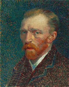


Julia Morgan, a California native, was the first female architect licensed in California. During her long California career, Morgan introduced reinforced concrete as a building material in 1904, thereby giving buildings resistance to earthquakes. She generally designed in the Arts and Crafts style, but also attempted to blend classical styles with it.
A “What If Wednesday” Post

Julia Morgan, who grew up in Oakland, California, was a woman of a number of firsts. She was the first woman to graduate at UC-Berkeley with a degree in Civil Engineering (Vihos 1997). She then studied architecture in Paris, France at the Ecole des Beaux-Arts and was the first woman accepted and to graduate (Geer 1998). Later she was the first woman in California licensed in Architecture (Reichers 2006). Julia is perhaps is most known for designing the Hearst Castle in California, leading to a relationship with the Hearst family for most of her career. This relationship led to her designing a lot of YWCAs and women’s organization buildings.

Some of her first designs were in the California Mission style of Architecture, though she was best known for her Arts & Crafts style. However, she was flexible and designed in the styles that the client wanted. Morgan, when possible, tried to design using local materials similar to Charles Dickey. She was one of the first architects in the United States to use reinforced concrete in buildings in 1904, a technique she had learned in Paris (Reichers 2006). Reinforced concrete was used in rebuilding San Francisco, CA (McBroom 2021) after her buildings survived the 1906 earthquake, thereby demonstrating in a real-life the resistance to earthquakes.
Julia was known as “the client’s architect” because of her attention to what the client wanted (Geer 1998), leading to her having many repeat clients (Vihos 1997). Her office was located in San Francisco and she designed more than 700 buildings throughout her career.
In 2008, she was inducted into the California Hall of Fame (Stephens 2014) and in 2014, she was posthumously awarded the Gold Medal from the American Institute of Architects (Hawthorne 2014). Additional honors celebrating Julia Morgan include a poem (Fagan 2014) and a play called “Becoming Julia Morgan” about her life (Taylor 2011).
The Basics of a Julia Morgan Website
A website using the style of Julia Morgan would blend functionality and elegance, reflecting her dedication to beauty and practicality. The overall tone of the site would be informative, yet engaging and would cater to a large audience.
- Website Visuals
- Color Palette: Julia Morgan was known for using pottery in her building designs and balancing modern aesthetics with vintage charm. Reflecting this, a website inspired by her would incorporate earth tones such as terracotta, olive green, and cream colors, replicating the natural building materials she used (stone, brick, wood). Accents such as calls to action buttons could include her signature color of cobalt blue.
- Handcrafted Typography: Serif fonts with clean lines and good legibility, would recall the Arts and Crafts movement that influenced her work. These fonts would also evoke a sense of tradition and attention to detail.
- Stone & Brick Textures: A website inspired by Julia Morgan would feature subtle textures mimicking stone and brick, giving the site an earthy yet refined appearance, similar to Hearst Castle. Another example of the use of wood and stone is the F.A. Thomas house that has redwood interiors with native stone (Baxter 2004).
- Arches & Columns: The use of elements that simulate arches and columns pays homage to the Mission Revival architecture in Julia Morgan’s architecture.
- Iconography: Intricate and minimalist icons representing various functions on the site replicate the art nouveau motifs seen in Julia Morgan’s ironwork.
- Website Layout and Functionality
- Clear and Uncluttered: Julia Morgan wanted her buildings to be functional and practical. As such a website inspired by her would be clean and uncluttered. Navigation would be intuitive and user-friendly.
- Subtle Animations: Animations on hover or scroll can add some dynamism without overwhelming the user.
- Include Hand-Drawn Elements: Hand-drawn elements or decorative touches can be included to reflect Julia Morgan’s artistic background and the handcrafted quality of her buildings.
The Color Palette in a Julia Morgan Website

A balanced color scheme should be used in a Julia Morgan inspired website. Cream should be a dominant color to promote openness and other primary colors should be accents. Accent colors should be just be used for places that you want to draw attention such as calls to action.
When using the colors, be sure that adequate contrast is maintained to conform to the Web Content Accessibility Guidelines (WCAG). Conformance to these guidelines is especially important for backgrounds and text.
While the colors below are generally th most selected, be sure to adjust the palette for your particular use case. For example, a website on Hearst Castle, might include more gold accents and one on libraries may have bright blues. Just make sure the selections are visually appealing, user-friendly, and meet color contrast requirements of WCAG.
- Primary Colors: These are the main website colors to use. Warm colors pay tribute to the sunny California landscapes that Julia Morgan’s buildings were set in.
- Terracotta: This earthy red-brown color, often used by Julia (Tattelman 2009), reminds one of the clay tiles in the roofs and building exteriors designed by Julia Morgan. In addition, red-brown colors ground the website.
- Olive Green: This green color reflects the natural world and can be used for backgrounds and text. They can create a sense of tranquility and balance.
- Cream: This color acts as a canvas for the other colors giving a sense of lightness and spaciousness. It would help the other color pop out more.
- Accent Colors: These colors are used sparingly and only to draw attention to specific elements such as buttons or headlines.
- Cobalt Blue: This is Julia Morgan’s signature color was used for the pools at Hearst Castle and adds vibrancy and sophistication. It can be used to draw the user’s eye.
- Muted Greens and Browns: To complement the primary colors use lighter shades of green and brown. These colors are appropriate for borders, patterns, and hover effects.
- Gradient Effects: Using gradient effects can transform simple geometric shapes into dimensional objects, thereby increasing visual appeal and making stronger emotional connection with users. Smooth transitions between adjacent colors can give an impression of fluidity and motion.
Typography in a Julia Morgan Website
Julia Morgan designed for elegance and functionality as well blending style and substance. Website fonts should reflect these goals. Below are some fonts achieving these goals.
- Serif Fonts: These fonts reflect Morgan’s architecture and give the decorative flourishes and geometric detailing found in her buildings. Selected fonts should have clean lines, good legibility, and be timeless. Some examples include:
- Garamond: A classic serif font, known for its elegance and readability, that can be used for headings and body text.
- Trajan Pro: A robust serif font having a strong presence and is suited to headlines and navigation elements.
- Playfair Display: A modern serif font giving personality making it ideal for calls to action and emphasis.
- Try to Look for Fonts with an Arts and Crafts Influence: These fonts provide a handcrafted feel along with some asymmetry for interest and evoke Julia Morgan’s love of the Arts & Crafts movement. Some examples include:
- Goudy Old Style: A font reminding one of handcrafted printing and provides a warm feeling.
- Kelmscott: A bold and decorative font used for emphasis.
- Use Tyographic Animation: Try to introduce animations that are tied to scroll position or mouse movement to bring static letters to life. Julia Morgan embraced technological innovation and this would emulate her legacy to appeal to modern audiences.
Stone & Brick Textures
Stone and brick textures bring a tangible and organic quality to the design of the website and replicate the stone and bricks used in Julia Morgan’s architecture. These textures help to create depth and interest, enhancing the overall aesthetic appearance. Ways these textures can be used in a website include:
- Background Images: Use subtle background images of stone, bricks, and masonry pattern close-ups. Inspiration can be taken from the Frederick B. Ginn house (Longstreth 1982).
- Texture Overlays: Use transparent overlays of stone and brick textures to embellish and dress up active elements like buttons, headers, and footers to give a classic feel to the website.
- Pattern Usage: Geometric patterns using intricate brick and stone arrangements, common in Julia Morgan’s designs, can add visual harmony and break up large monochromatic blocks of color.
- Material Gradients: Use a gradient simulating weathered stone surfaces to provide a sense of age and authenticity to graphical elements. Material elements blend new media and old-world charm.
- Animated Transitions: Parallax scrolling combined with texture adds dynamism and engagement to page transitions, giving users an immersive and multi-dimensional experience.
Simulating Arches & Columns in a Website
A lot of Julia Morgan’s architectural work employed the use of arches and columns, fusing form and function. Balancing artistic flair with functional precision honors Morgan’s contributions to architecture. Ways you can replicate this in your website include:
- Header Elements: Column-like structures can be placed on either side of the main header area, establishing symmetry.
- Navigation Menus: Arch shapes can be used in dropdown lists or menu dividers giving an intutitive categorization. Arch shaped buttons can be used with hover effects to provide dynamic feedback.
- Section Separation: Half-circle or semi-elliptical arches can be used as horizontal separators to define individual content sections. These can also make scanning easier and break up long pages.
- Image Features: Images and galleries can be enclosed with arching frames to give sophistication and draw attention to focal points.
- Footer Design: The footer can use miniature arches housing social media icons or copyright info and balance out the header.
Using Iconography in the Website
Icons reflect the Art Nouveau motifs used in Julia Morgan’s architecture. Having a unique icon library allows the website to communicate ideas efficiently, fostering a coherent visual vocabulary that is less cluttered. Below are some ways to use icons in your website:
- Overall Design Style: Icons should have flowing curves, sinous lines, and organic forms to show unity and familiarity with the rest of the site.
- Each Subject Should have its Own Icon Set: Similar icons streamlines user interaction and reduces clutter. Easily recognizable graphical indicators also assists users in finding desired features.
- Icon Colors: Colors should match the warm color palette, descibed above, to integrate with the surrounding elements.
Having a Clear and Uncluttered Website
Julia Morgan’s architecture had a core principal of functionality and your website should be as well. Her design philosophy can be honored by having a clear and uncluttered website. How can you have a functional website? Read on to find out.
A Clear and Uncluttered Layout
- Grid System: Grid systems to give structure, visual order, and balance. The grid can make sure that there is consistent spacing between the elements and produce a clean look.
- Whitespace: Have ample space between website elements, giving breathing room and improving readability.
- F-shaped Layout: Place content in an F pattern, starting at the top left, and then moving right across the top, and down the left side in a vertical scan. Put information that is important within the “F” to have optimal user engagement.
- Be Sure to Have Responsive Design: Nowadays this should be a given, but make sure your website adapts to your user’s screen, giving a positive user experience and making search engines happy too.
A Functional Layout
- Have Navigation that is Intuitive: Users should be able to easily find the information they need with minimal clicks. Use a top navigation menu on desktops and a hamburger menu on mobile devices. Minimize the use of sub-menus as much as possible.
- Use Limited Elements: Do not bombard your users with a lot of elements on a single page. Give only the most important information, at first, and then progressively give out more information, upon user interaction.
- Focus on User Tasks: Identify the primary tasks your users are trying to accomplish in order to determine the most important information.
- Layout Design: Layout the design and functionality based on what you find about the primary tasks above.
- Search Functionality: Some users are looking for specific information. Or secondly, you may have a large website. If either is so, provide a search bar allowing users to quickly get the information they seek.
- Have Minimal Animations and Transitions: In order to provide an uncluttered and seamless experience, avoid a lot of animations. Animations can distract users, and worse, slow down your webpage.
The Use of Subtle Animations
In the previous section, we talked about having minimal animations. But what if you want to have some animation, how do you go about it? The answer is to use them in a subtle way. Below are some tips on how to do this without destroying the uncluttered feel.
Types of Subtle Animations that can be Used
- Microinteractions: Tiny interactions happening in response to specific user interactions and acting to provide feedback.
- Hover Effects: A button changing color or opacity when a user hovers over it. These effects also help with the accessibility of your website.
- Form Validation: Form fields might give a gentle shaking appearance when invalid data is entered, indicating to the user that they need to correct it.
- Progress Indicators: When a process is still ongoing, a spinner or loading bar can be used to show it.
- Scroll-triggered Animations: These are animations triggered when a user scrolls down the page, giving a sense of depth. Here are some examples:
- Fading Elements: Content sections or images might fade in gradually as the page is scrolled down, keeping and guiding user’s attention.
- Parallax Scrolling: Having background elements move at a slower pace as compared to foreground elements, producing a layered effect that adds depth upon scrolling. Only use this effect once on a webpage, such as the hero, in order to not overwhelm users. Remember you need to keep animation at a minimum to follow the principle.
- State Animations: Animations can be used to indicate changes in state for elements like menus or accordions. Examples of these include:
- Slide-in Menus: Menus can slide in smoothly from the side when a hamburger menu is clicked.
- Accordion Toggles: Accordion panels might expand or collapse with subtle animation, but not a jarring or fast animation.
Principles for Subtle Animations
- Animations Should have a Purpose: Every animation should be well-thought out and serve a clear purpose, such as enhancing functionality, guiding the user, or providing feedback. Do not have animations for the sake of having them.
- Subtle and Refined: To align with Julia Morgan’s emphasis on elegance, animations should be tasteful and smooth.
Example of a Julia Morgan Inspired Website
Julia Morgan, designed a lot of buildings for women’s organizations in California. These included a lot of the YWCA buildings in southern California, the buildings of Mills College, and the Saulsalito Women’s Club. The website below celebrates women in science who were from or lived in California and follows Julia’s legacy of helping women.

Conclusion
Julia Morgan was a woman of many firsts in her field and a great architect. Her many buildings around California is a testament to her dedication and work.
References
- Baxter, Arlene. 2004. A house of redwood, oak, & stone. Old-House Interiors 10 (4): 60-66.
- Fagan, Kathy. 2014. Ode to Julia Morgan. Ninth Letter 11 (1): 172.
- Geer, Betty. 1998. The house that Julia built. Cricket 25 (7).
- Hawthorne, Christopher. 2014. Julia Morgan. Architect. 103 (6).
- Longstreth, Richard W. 1982. The Architecture of Julia Morgan. Helicon Nine 6: 20-31.
- McBroom, Kathleen. 2021. Julia Morgan: An Intimate Biography of the Trailblazing Architect. 118 (4): 18.
- Reichers, Maggie. 2006. Beyond San Simeon. Humanities 27 (5) 26-30.
- Stephens, Suzanne. 2014. A Woman for All Reasons. Architectural Record 202 (5).
- Tattleman, Ira. 2009. Morgan, Julia (1872-1957). GLBTQ Arts 2009 1-3.
- Taylor, Belinda. 2011. On the West Coast: The Julia Morgan Project. 3 (1): 24-25.
- Vihos, Lisa. 1997. Pioneer in Architecture: Julia Morgan 1872-1957. New Moon 4 (3).