


Since Claude Monet’s paintings served as the underpinning of modernism, he will be discussed as part of this Wednesday’s What if? If Monet were alive today and could design a website what would it look like? Let’s find out.
A “What if Wednesday” Post

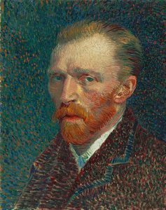
In previous posts we have discussed architects and designers who practiced modernism. Claude Monet, a French painter, and a founder of impressionist painting, is widely seen as the pre-cursor to modernism in that he painted nature as he saw it. Generally, he used his garden in Giverny, France for inspiration, and some of his most famous art came from here. The actual term of impressionism came from one of Monet’s paintings, “Impression, Sunrise” (Murphy 2017).
Claude Monet lived from 1840 to 1926 and painted throughout France, generally in the Seine River valley, London, and in his garden in Giverny, France (Gilroy 2020). His speciality was plein air (landscape) painting. In Giverny, he had a famous garden, where he spent a lot of time painting water lilies and other flowers.
Claude Monet’s impressionistic paintings served as the underpinning of modernism and modern art (Modern Age 2006), and the later revival as abstract expressionism (Scott 2009).
The Basics of a Claude Monet Website
Most of Monet’s paintings used light and fleeting moments to create a fuzzy impression of what he was seeing. Generally a website by Claude Monet projects a sense of the peace and tranquility present in his garden. Similar to Frank Lloyd Wright, Monet was trying to give the feeling of nature as he saw it. Some website features of a Claude Monet design would include:
- Website Visuals: Visual elements following the Impressionist tradition of bringing feeling to images.
- Soft Backgrounds: Claude Monet used watercolor washes and blurred gradients to create a soft, dreamlike background. Common expressions included hazy skies and sun-dappled gardens.
- Impressionistic Elements: Instead of using high-quality photos like the modernists, Claude Monet used brushstroke-like textures and varying color palettes, bringing focus on the feeling of the scene.
- Animated Elements: Subtle animations could bring the website to life, such as sunlight dappling through leaves, shimmering reflections on water, or gently swaying flowers.
- Website Features: Website features would enhance the feeling as much as the information presented.
- Focus on Scrolling: A Claude Monet website would have a single page layout with parallax scrolling, allowing different sections of the image to be viewed sequentially, and showing information gradually, thereby intensifying the feeling.
- Interact Content: Hovering over elements would trigger a change in color or light, the same way that light interacts with objects in this paintings.
- Muted Color Palette: While using wide brushstrokes, Claude Monet, also used a muted palette of blues, greens, yellows, and pinks and were the colors of the plants present in his garden.
- Minimal Text: On a Claude Monet designed website, text would be minimal in order to not distract from the overall meaning. Generally, it would be as captions or descriptions.
The use of Soft Backgrounds

Claude Monet used soft backgrounds as a foundation, setting the mood of his paintings, and drawing the viewer’s eye to the focal point. You can replicate this in a website.
Ways to Use Soft backgrounds in a Website
- Use of Color: Use neutral colors such as light grays, beige, soft blues, or pastel colors, while not using anything that is bright or saturated, thereby detracting from the focal point.
- Blur the Elements: Creating some blur reduces detail and creates background depth. Blurring can be done through shallow depth of field or in design software with blur filters.
- Create Gradients: Use gradients to transition from one color to another to create a softness in the background. For example, a light blue upper half combined with a soft white lower half, which simulating a clear sky fading into the horizon.
- Use Textures: Add in watercolor washes, canvas textures, or light grains to add visual interest. Just do not make it too overwhelming.
Benefits of Soft Backgrounds
- Emphasizes the Subject: A soft background does not compete for attraction and helps the main subject stand out.
- Influences the Mood: Color and texture can influence the overall mood. For example, light colors for tranquility and peace and dark colors for mystery or sophistication.
- They are Versatile: Soft backgrounds can be used in a number of visual styles and be reused.
Examples of Soft Backgrounds
- Portrait Photography: A blurred background might be used to make a person or object the clear focus of the image. An example is the blurred background used in Zoom meetings.
- Website Design: An eCommerce site with minimalist products might use a soft gradient to create a clean look.
- Watercolor Paintings: Watercolor washes are often used to create soft backgrounds. These can be created using photo-editing software.
What Exactly are Impressionistic Elements?
Claude Monet was an expert and founder on the use of impressionist elements in his paintings. Impressionistic elements prioritized the feeling and atmosphere over the perfectly rendered image and contrasted to those of earlier Dutch and Flemish artists. However, what exactly are impressionistic elements?
- Loose Brushstrokes: Instead of having smooth discrete strokes, impressionists used visible brushwork to convey a sense of energy and movement. An example would be Claude Monet’s water lilies, in which the water with swirling strokes suggests movement and reflection.
- Broken Color Palettes: Impressionist painters prodcued a broken color by using dabs of pure colors next to each other on the canvas rather than mixing them beforehand. As a result, the viewer’s eye blends the colors, making it more vibrant.
- Focus on Light and Shadow: Impressionists were interested in how light interacts with objects and how it changes during the day. Different colors and brushstrokes were used to imitate this effect on the canvas. An example is Claude Monet’s haystacks, where the sunlit side has a golden color and the shade side has blues and purples.
- Suggested Forms: Impressionists often produced hints of objects rather than being meticulous with them. This left the viewer to use their imagination, thereby creating a more engaging experience.
How to Get Impressionistic Elements on Your Website
- Use Digital Graphic Tools: You can use software such as GIMP or Adobe Photoshop to mimic the texture of real brushstrokes on images and backgrounds. You can also layer different colors and then use the opacity settings to produce a broken color effect.
- Photography: When taking an image you can use selective focus or long exposure times and then use the digital tools above to produce a more interesting effect.
Benefits of Using Digital Tools
- Mood and Atmosphere: Adding impressionistic elements to your website can capture the mood and atmosphere you want. Having the effect of loose brushstrokes and focusing on light can produce a sense of serenity, joy, or even melancholy.
- An Emotional Connection to the Site: By suggesting the shapes, viewers are left to fill in the details, provoking a more active connection to the website.
- A Feeling of Movement: The use of loose brushstrokes and suggested outlines produces a sense of movement.
The Use of Animated Elements

If Claude Monet were doing a website, he may have used animated elements to further tell the story in his work. Since the impressionistic elements he used provided suggestions of form and movement, it would be natural to actually want movement as part of a website. The use of animations would provide increased engagement, improved clarity, enhanced storytelling, and more of an emotional connection.
Examples of How to Use Animation in a Website
- Micro-interactions with Elements: Subtle animations such as a button that bounces slightly when you hover over it.
- Including Videos in Your Website: Include explainer videos as part of your website. These could be used to show products, services, or complex concepts.
- Interactive Infographics: Use animation as part of an infographic to make it more engaging.
Using Scrolling in a One Page Website
Claude Monet would have likely aimed for a one page website in order to convey the information in a series of sections. Using a one page website would allow for the content to be revealed as the user scrolls down. Other techniques he may have used include:
- Parallax Scrolling: This scrolling technique creates a sense of depth and a more immersive experience with the image.
- Content Chunking: This involves breaking the information into digestable chunks such as having text sections, infographics, and images.
- Providing Visual Cues on Site Location: Having progress bars or scroll indicators allows the user to know how much content is left to discover.
- Using Interactive Scroll Triggers: Animations, text reveals, or interactive elements would be triggered by scrolling to specific areas of the page. This keeps readers engaged with the page. If using this technique, make sure it is able to be tabbed through for website accessibility.
What are the Benefits of a Scrolling website
- It Can Improve the User Experience: Scrolling through a site can be more intuitive and natural than going through multiple pages. This is especially true for those readers using a mobile device.
- Enhanced Storytelling Experience: A single-page layout tells a story in a more cohesive and sequential way.
- Increased Engagement: Scroll triggers and content that is chunked into sections can keep readers engaged and willing to scroll deeper.
- Better Mobile Responsiveness: Scrolling websites tend to do better with mobile responsiveness and are easier for mobile browsing in general.
Examples of Scrolling-Focused Websites
- Landing Pages: This singular purpose page is scrolled through to reach the call to action.
- Portfolio Websites: Designers and creatives often showcase their work through a scrolling portfolio allowing viewers to see the projects at their own pace.
- Long-form Articles: News sites and blogs having long articles use a scrolling layout, along with well-structured content that flows, helping to improve readability.
- Single-Product Websites: If your website has just a single product, you can utilize scrolling to highlight different features and benefits with visuals and text.
Interactive Content
The impressionists wanted viewers to interact with their paintings and complete the painted forms within on their own. Claude Monet, being one of the founders of the style, would have likely included interactive elements in his website. These interactive elements can include:
- Quizzes and Assessments: These elements can be used to get user information or personalize the experience. For example, a gardening website, could have a color, location, and site condition quiz that recommends plants based on yout answers.
- Calculators and Cost Estimators: These calculators helps users estimate costs or make financial conditions. For example, you could find out how much mulch costs based on type and cubic footage needed, such as I have for the Tri-State Mulch website, here in Pennsylvania.
- Polls and Surveys: You can engage users in polls to get valuable feedback and help improve the website or business.
- Drag-and-Drop Elements: Allows users to customize layouts or explore information in a hands on way. An example would be a website builder.
- Galleries with Overlays: These are image or video galleries displaying additional information when hovered or allowing visitors to zoom in on details.
- Gamification: You can have game-like elements in a site like points, badges, or leaderboards to motivate users to complete tasks and coming back for more. An example would be an e-learning platform that gives awards for completion of assignments or courses.
Benefits of Interactive Content in Your Website
- Increased Engagement by Users: This content keeps website users involved looking for more and thereby coming back to the site.
- Improved User Experience: Allows users to personalize their experience, making a more enjoyable website.
- Enhanced Learning and Retention: Users are more likely to remember information that is gained through active participation.
- User Data Can be Obtained: This kind of content generates user data, used to personalize content, and fine-tune marketing strategies.
Examples of Interactive Content for Websites
- Product Configurations: A car company website could virtually customize a car by color, wheels, or interior options.
- Product Views: Product views could be used to zoom in and look around the product giving a more immersive experience.
- Live Chats and Chatbots: Using artificial intelligence (AI) users can get real-time assistance or answers to questions, thereby improving customer service.
- Interactive Maps: Interactive maps could be used to allow users to see where you are located and what else is in the area.
Muted Color Palette

A muted color allows the viewer to imagine in their own mind what the true colors are in the website, just as they would in an impressionist painting. These colors have less saturation and are not as harsh, softer, and are less vibrant.
How to Choose a Muted Color Palette
- Desaturated Primaries and Secondaries: Monet had a lot of garden flowers in this paintings containing the colors of red, blue, or yellow. Instead of bright versions of these colors, he used muted colors, such as dusty rose, teal, or mustard. These colors are similar to their brighter versions, but are calmer and more sophisticated.
- Earthy and Natural Tones: A muted palette is composed of colors found in nature such as beiges, taupes, grays, and the soft greens of leaves. The use of these colors can create balance and tranquility and ideal for websites projecting readability and user comfort.
- Pastel Colors: These are paler versions of primary and secondary colors, for example, baby blues, lavenders, or peach tones. These colors soften the overall feel adding to user comfort.
Benefits of Muted Colors
- Improved Readability and Less Eye Strain: Muted colors are easier on the eyes. If you have a lot of text content, these colors may be a good choice.
- Enhanced User Experience: Muted colors can create an overall atmosphere of calm and focus, making the overall experience more relaxing.
- Versatility: Almost any color can be muted, which means these colors can generally be used in any website aesthetic.
- Emphasizes the Content and Functionality: By not having overly bright or distracting colors, you allow the content of the website and it functionalities to take center stage.
Examples of Muted Colors in a Website
- E-Commerce Websites: The use of muted colors in a product showcase, allows the products to stand out without being overshadowed by a color sideshow.
- Portfolio Websites: Muted colors can create a professional and sophisticated presence that compliments your work.
- Blogs and New Websites: As stated previously, if you have a lot of text, muted colors can improve readability and provide a more focused environment.
- Minimalist Websites: As we saw in the posts on Frank Lloyd Wright and Mies van der Rohe, muted natural colors can be used, while emphasizing clean lines, whitespace, and simplicity.
Things to Consider While Using Muted Colors
- Accent Colors: While the overall colors of the website should be muted, a more saturated color can be used to highlight calls to action and important elements.
- Accessibility: Bear in mind that used muted colors can be a color contrast minefield for meeting Web Content Accessibility Guidelines (WCAG). When choosing your colors, be sure to use a color contrast checker, such as the WebAIM Contrast Checker, to make sure your color contrast ratios meet the specifications. Use the colors of Claude Monet, it can be done, however, there may be some extra work and trial and error.
- Mood and Brand Identity: The use of muted colors helps convey feelings of calmness, trust, and/or professionalism. If your brand consists of these feelings, an impressionistic type website may be for you.
Minimal Text
In numerous areas of this post we have talked about minimal text. Claude Monet, as an impressionist painter, wanted viewers to focus on the visuals of the artwork. While artwork generally does not have text, using minimal text on a website can bring the visuals of the site into more prominence. These visuals can include images, videos, and infographics.
This is not to say that a Claude Monet inspired website cannot have a lot of text. As stated earlier the muted colors can be used to make text heavy sites more comfortable to read. This adds a lot of versatility to his designs.
How to Use Minimal Text
- Use Strong Headlines and Subheadings: Headlines should be clear and concise and not leave too much ambiguity.
- Bullet Points and Lists: Break content into digestable chunks.
- Use Icons and Symbols: Using icons and symbols that are universally understood can convey information without using words.
Examples of Miminal Text in a Website
- Landing Pages: Landing pages by their very nature call for minimal text as they focus on a single objective of clicking the call to action.
- Portfolio Websites: Let the images do the talking with a brief explanation.
- E-Commerce Product Pages: Focus on key features and specifications.
Examples of Websites that Could use the Claude Monet Style
Given all of the above, you may be wondering about some real world examples of websites that would benefit from Claude Monet’s impressionistic style. They are divided into website types.
- Peaceful and Tranquil Websites:
- Meditation or Yoga Studio Websites: These websites have calming visuals, soft/muted color palette, and minimalist layout to create peace and serenity.
- Spas and Wellness Centers: These websites benefit from the sense of relaxation, creating a virtual sanctuary.
- Nature Photography Websites: Photographs of nature and gardens can evoke a sense of tranquility, when paired with impressionistic elements.
- Immersive Websites:
- Virtual Reality Experiences: Websites using virtual reality helping to create the active imaginative world that Claude Monet sought to create.
- Interactive Product Demos: Websites offering 360 degree views or ways of interacting with a product other than a static image.
- Storytelling Websites: Websites telling a story, such as those dealing with travel, historical landmarks, or story maps. These sites can use parallax scrolling, interactive maps, and multimedia content.
Example Website Inspired by Claude Monet

Conclusion
Compared to the modernists of previous posts, the impressionists, such as Claude Monet, relied more on active user involvement in their material. The modernists, on the other hand, rely on passive user involvement to help guide users. A website using Claude Monet’s techniques would rely on the reader’s eye to interpret the material and would be easy going and comfortable with few distinct lines or cues.
References
- Gilroy, James P. 2020. Claude Monet: The Truth of Nature. The French Review 94 (2): 245-246.
- Modern Age. 2006. 1900-2000: A Biographical Dictionary of Western Culture. 573-575.
- Murphy, Daniel P. 2017. Mad Enchantment, Claude Monet and the Painting of the Water Lilies. Magills Literary Annual 366-370.
- Scott, Julia. 2009. ‘Gliding the Waterlily’: The Monet and the Impressionsists exhibition and the dialectics of visual art and commodity culture. New Zealand Sociology 24 (2): 62-79.