Just in time for Independence Day, which is tomorrow, today’s “What if Wednesday” will discuss the first American born architect, Charles Bulfinch. Charles Bulfinch (1763-1844), was born in and lived in Boston, Massachusetts, but also lived for a awhile in Washington, DC.
“A What If Wednesday” Post

Charles Bulfinch designed a lot of the governmental buildings in the early American republic including the Massachusetts State House, and the Connecticut State House. He finished the design of the US Capitol in Washington, DC, after the resignation of Benjamin Henry Latrobe in 1817 (Marks 2013). Besides being an architect, Bulfinch served as a selectman for the City of Boston and was clerk of the market in Boston (Kirker 1963).
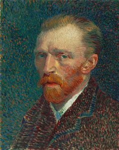
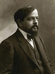
Charles Bulfinch was a promoter of Neoclassicism (Maurer 2001), which is also called the Federalist Style. A lot of his architectural styles were influenced by architecture from France and Italy (Conroy 2006), which he saw close-up during trips to Europe. Previously in the series, we discussed Claude Monet, Claude Debussy, Alvar Aalto, and Vincent Van Gogh, who were from Europe.

While Charles Bulfinch design a lot of governmental buildings, he also designed the Nichols House in the Beacon Hill Neighborhood of Boston (Seavey 2016) and many other Beacon Hill houses (Klee 2009). Bulfinch is also considered to be the inspiration for the Bull & Finch Pub in Boston, MA, which was used as the setting for the Television sitcom “Cheers.” This bar is now called the Cheers Bar and is a tourist landmark in Boston.
If Charles Bulfinch were alive today and were to design or inspire a website, what would it look like? Read on to get some idea as to what it may be.
The Basics of a Charles Bulfinch Website
Generally, a website by Charles Bulfinch, would resemble the Federal style, prioritizing elegance, symmetry, and balance. Essentially, the website, should be a modern reflection or interpretation of the Federal style. Below is an outline of some of the main features.
- Website Visuals
- Color Scheme: Classic colors of early America, such as red, white, and blue, joined by accents of gold or black would be used. The gold and black give a touch of sophistication.
- Backgrounds: Simple, light-colored backgrounds would create a clean and airy feel and emphasize the whitespace. Some backgrounds to consider are damask patterns or geometric shapes, as a shoutout to the decorative elements of the Federal period.
- Fonts: Serif fonts, like Georgia or Garamond, would evoke a sense of formality and tradition to the site.
- Layout: A grid-based layout with a clear hierarchy of information would be used to organize the content into symmetrical columns or sections. The grid should mirror the balanced proportions of Charles Bulfinch’s buildings. Borders, that mimic moulding, can be used around content sections.
- Imagery: High-quality images or engravings should be used that are related to the website’s content. For instance, these could include portraits, landscapes, or architectural drawings reflecting the Federal era.
- Website Features
- Navigation: A simple and intuitive navigation bar placed horizontally along the top would be used.
- Headings and Titles: Large, clear headings would be included with subtle decorative elements such as lines or Federalist icons such as domes, columns, or quill pen lines.
- Subtle Animations: Gentle hover animations or fading colors can give some interactivity to buttons and maintain a sense of elegance.
- Limited Multimedia: A Charles Bulfinch website would be primarily text and image driven, which is emblematic of the late 1700s to early 1800s. Videos, if they are used, should be very little in amount and complement the overall design. If you have an e-commerce website, try to arrange products in a gallery format.
- Historical References: If the website content has any relation to history, consider adding sections with historical facts or timelines.
The Color Scheme of a Charles Bulfinch Website

To reflect the Federal period, there should be a balance of the colors used. White, or a shade of it, will be the main color, interspersed with red and blue that are present throughout the site. Red and blue, however, should not overpower the site, so as to be dominant in their own right.
Choose your colors based on the website’s overall theme. For example, a lighter red can be used for a modern subject, while a deep blue can give a more authortitative tone to the site. Below is a review of the color usage.
- Primary Colors: The primary colors would be emblematic of the early American republic.
- Red: A deep red, such as Federal Brick, used in Charles Bulfinch’s buildings, would form the foundation of the textual background colors. This red color could also be used for headings, buttons, or accents.
- White: White, forming the whitespace, would be the dominant color, and represents the elegant simplicity of the Federal style. Beyond the whitespace background, this color can be used in text boxes, and the main content areas.
- Blue: Colonial blue, which gives a calming effect, provides a sense of trust and authority. The use of blue should not be as prominent as red and white, and can be used for subheadings, navigation elements, or subtle highlighting of elements.
- Accent Colors:
- Gold: Gold adds a sophistication and brings about the decorative elements of the Federal period. It should be used sparingly for borders, icons, and button highlights.
- Black: Black can be used to give contrast to text and to outline decorative elements in the site.
Examples of Color Usage
An example of a possible Charles Bulfinch website would have a crisp white background (see the next section on backgrounds) with headings in Federal Brick and subheadings in Colonial Blue. Navigation elements could be outlined in a gold line to make them stand out. All of these elements together would forge a classic and elegant website that brings out the spirit of Charles Bulfinch and reflects the Federal style.
Backgrounds in a Charles Bulfinch Website
The background of the website, while reflecting on the simplicity of the time, should complement the overall design and enhance the user experience by providing contrast to the other elements. Following the guidelines below, can ensure that your website has the elegance and the sophistication of the Federal style.
- Use Solid Light Colors: A plain white or light beige background can give a clean and airy feel, and bring about the feeling of the bright interiors of Charles Bulfinch’s buildings. A white shade background is the most versatile of the website elements and should help make the text more readable.
- Use Subtle Patterns Remiscent of the Time: Historical patterns can be used such as:
- Damask Patterns: A popular fabric during the Federalist time was damask. A subtle incorporation of this pattern can be used to add a touch of sophistication to the site.
- Geometric Shapes: Simple geometric shapes like squares, rectangles, or chevrons can evoke the Federal style’s emphasis on symmetry and balance. Muted tones of the reds, whites, and blues, can be used to create the patterns.
- Be Sure the Patterns do no Distract: Whatever the pattern or shape used, make sure it does not distract from the overall simiplicity of the website.
Background Examples
- A website for a History Museum: This background could have a very faint damask pattern using a light shade of colonial blue. The background would provide a hint of history without detracting from the museum’s exhibits.
- E-Commerce Shop: A clean white background would be ideal for showcasing products. It would allow the products to be the center of attention and give clear visibility to customers.
Fonts in a Charles Bulfinch Website
The fonts on the website can be used to bring out the formality, tradition, and elegance of Federal architecture. Generally serif fonts should be used, however, sans-serif fonts can be used if they have clean lines and good legibility. Below are some font choices in the spirit of the Federal style.
- Serif Fonts: Serif fonts have a decorative flourishes, called serifs, at the ends of the strokes. These were the primary fonts used during the time of Charles Bulfinch, would most accurately represent the era and give a classic and sophisticated look. Just be careful to make sure that the font used is accessible according to the Web Content Accessibility Guidelines (WCAG). Two choices to use include:
- Georgia: This font is widely available and provides good readability. The clean lines and subtle curves makes it useful for headings and body text.
- Garamond: This font is more historically accurate and has more decoration. It can be used in the same areas as Georgia font and gives a more traditional feel.
- Sans-Serif Fonts: These fonts do not have the decorative flourishes that the serif fonts have. If a more accessible font is needed, these type fonts can be used. Two examples are:
- Open-Sans: The Open-Sans font gives a neutral and clear appearance and can be used for navigational elements, buttons, or short excerpts to give a more modern touch.
- Franklin Gothic: This font is more reflective of the early American republic and is good for those websites having a historical focus.
Things to Consider in Selecting Fonts
- Font Pairing: If you are using 2 or more fonts, make sure that they are compliment each other. If you are seeking to bridge both the historic and the modern, a combination of Georgia (Historic) and Open Sans (Modern) would be a good choice. For example, Georgia could be used in the headings and body text and Open Sans in the navigation and buttons.
- Make Sure the Selected Font is Easily Readable: It was touched on briefly above, but serif fonts tend to be difficult to read, especially for those with visual or cognitive impairments. Make sure any font selected is easily readable. Experiment with different font weights and line spacing to achieve readability.
- Preserve the Historic Aesthestic with Serif Fonts: Have a serif font as the dominant font to preserve the historic nature of the website. However, use a sans-serif font if accessibility requires it.
Layout in a Charles Bulfinch Website
A website designed or inspired by Charles Bulfinch would have symmetry and balance as a focus, along with clear organization. Generally, four things are needed to achieve the layout, which are below:
- Grid-based Structure: The content of the website should be organized on a grid system to position elements in a visually pleasing and balanced way.
- Symmetrical Design: Make sure that elements on one side mirror the elements on the side. The symmetry creates a sense of order and formality. However, in some places, deviate from the structure to create some visual interest.
- Sections and Columns: Divide the content into clear sections using both the horizontal and verical axes. Use columns for text and images in order to mimic the balanced columns seen in Charles Bulfinch’s facades.
- Whitespace: Use a lot of whitespace to help the balance and symmetry and to give the elements room to breathe.
Examples of How Layout Elements are Used
- Header: Have the header span the entire width of the website and have within it the logo, navigation bar, and a hero image or tagline.
- Main Content Area: House the primary content of the website here and organize it into sections with clear headings and subheadings.
- Sidebar: Use a sidebar on either or both sides to use for secondary content.
- Footer: Contain information such as copyright information, legal content, contact details, and social media links in the footer.
How to Use Imagery in a Charles Bulfinch Website

The imagery used in a Charles Bulfinch website would emphasize quality and style and incorporate visuals that complement the Federal architectural aesthetic. Types of imagery could include:
- Historical Images: If you have a website that is of a historical subject, you could use historical engravings, portraits, or photographs reflecting the Federal era.
- Architectural Photography: Depending on the subject or focus of the website you could incorporate images of buildings and architecture from the Federal era.
- Themed Illustrations: Sometimes you may have a website that is not historical in nature, but where you want to evoke some feeling of the Federal era, such as a patriotic website. For these websites, consider having illustrations of people in period clothing, landcapes of the early republic, or objects such as furniture from the time or random decorative elements.
Style of the Images
As with all websites, images should be of high-quality and clear. In staying with the theme of the Federal era, images should be:
- Clean and Classic: Images should maintian a clear and classic aesthetic that mirrors the uncluttered elegance of the Federal style.
- Limited Color Palette: Consider using a color palette in the images, if possible, that complement’s the overall color scheme for the website.
Placement of the Images
- Use Images Strategically: The website should not be overwhelmed with images. Generally use images to enhance content and break up text.
- Alignment with Layout: In keeping with the symmetry of the Federal period, be sure that images are aligned with the grid-based layout of the website.
Examples of the Use of Images
Federal period imagery can be used in a variety of websites and not just in those that are academically historical. Below are some examples of website imagery that could be inspired by Charles Bulfinch.
- History Website: A website showcasing the life of George Washington could feature historical portraits alongside engravings depicting important events of the Federal period.
- Architectural Firm Website: An architectural firm that specializes in Federal style renovations could showcase high-quality photographs of Charles Bulfinch’s buildings and buildings of the period, alongside their own renovations.
- E-Commerce Shop: An online shop reproductions of Federal style furniture could use illustrations of their furniture in a historically accurate setting.
Website Navigation in a Charles Bulfinch Website
A website inspired by the Federal period should be clear and intuitive and reflect the structured orgnization of the period. Following are some of the styles and elements to be used.
Navigation Style
- Simple and Clear: The navigation bar should be straightforward and easy for users to understand. Avoid complex menus or dropdowns that overwhelm users.
- Horizontal Bar: The navigation would be very similar to those used today and placed horizontally. The horizontality mirrors the linear layouts from Charles Bulfinch’s buildings, but is also a component of modernism.
Navigation Elements
- Limit the Number of Links: Focus on only the most essential website sections to keep balance and order. Do not clutter the navigation with too many options.
- Use Descriptive Labels: Each navigation link should have a clear and concise label that accurately reflects the content of the linked page. Do not use creative terms that might confuse users. For example, some clear terms might be:
- Biography
- Architectural Works
- Legacy
- Contact
- Use Underlines or Hover Effects: Use subtle underlines or hover effects on navigation links that are not distracting. These are needed to comply with the Web Content Accessibility (WCAG) and follow with the Federal period aesthetic as well.
The Structure of Headings on a Charles Bulfinch Website
Headings are important in a Federal period website to maintain the balance and symmertry. They also serve a functional and aesthetic purpose. Headings used should:
- Be Concise: Headings and titles should be concise and to the point. They should accurately reflect the content following, without being overly wordy.
- Alignment: Headings should be centered or left-aligned in keeping with the balanced look and symmetry of the period.
- Include some Decorative Elements: A thin underline or decorative flourish of the time could be used to evoke some historical flair. However, decorative elements should be sparingly used.
The Use of Animations
Even though the Federal period was a while ago, animation can still be used to a limited extent to provide feedback and enhance the user experience. Any animations should serve a purpose beyond decoration in the site. Some examples of the use of animations include:
- Highlight Interactive Elements: Buttons or links can have a subtle cover hover effect and guide users to clickable elements.
- Improve Feedback: They can be a fade-in confirmation message after submitting a form.
- Guide Attention: Animations can draw the user’s eye to important information.
Types of Animations for Inspiration
- Microinteractions: These animations include single-task animations that occur with user interaction, such as a button changing color on hover to indicate clickability or a menu expanding.
- Entrance/Exit Animations: These animations are used for elements entering or exiting the viewport, such as a section fading in as the user scrolls down.
Things to Keep in Mind about Animations
- Animations Should be Classic and Refined: Animations should be smooth, elegant, and in line with the Federal aesthetic. Avoid those animations that are flashy or distracting and clash with the Federal style’s order and balance.
- Their use Should be Limited: Do not overwhelm users with animation. Remember, that they did not much in the way of animations during the Federal period.
Example of a Charles Bulfinch Inspired Website

Conclusion
Charles Bulfinch was the first American born architect and left an indeliable mark on the City of Boston and the Capitol of the United States. Even 200 years later, he is still evoked in popular culture with the Bull & Finch bar, known more commonly as the “Cheers” bar.
References
- Conroy, Thomas E. 2006. “Charmed with French”: Reassessing the Early Career of Charles Bulfinch, Architect. Historical Journal of Massachusetts 34 (2): 104-131.
- Jensen, Richard. 2021. Born to Build: As businessman Charles Bulfinch was a hot mess, but as an Architect he designed for the ages. American History 56 (2) 58-65.
- Kirker, Harold and James Kirker. 1963. Charles Bulfinch: Architect as Administrator. Journal of the Society of Architectural Historians 22 (1): 29-35.
- Klee, Jeffrey E. 2009. The Smaller Houses of Beacon Hill, Boston, Massachusetts. Vernacular Architecture 40 (1): 91-95.
- Marks, Arthur S. 2013. Chapter 8: William Nichols and Robert Mills: Taking the Attic Order South. Transactions of the American Philosophical Society 103 (5): 71-80.
- Maurer, David. 2001. Charles Bulfinch. Classic American Homes 27 (3).
- Seavey, Aimee. 2016. Boston Classic. Yankee Magazine 80 (1).


