Harnessing the Power of Color in the Digital Landscape
What if you lived in a world where a the presence of a single color shade could alter your scroll, spark emotions, and send you through a digital labyrinth. This is the power of color. In the field of graphic and web design, color is a strategic tool in your toolkit. It has the power to captivate, evoke emotions, and shape perceptions in an instant.
The new year in 2024, like a lot of other years will bring a new list of color trends that will transform the digital landscape, redefine visual experiences and redefine how brands connect with audiences. Continue reading to learn how to use color like a pro.
In 2024, artificial intelligence (AI) is being used more and more to produce colors, which are generating multiple design variations. This is leading to designs that are composition heavy and dot display graphics.
Here's a short list of the trending colors in 2024:
- Radiant Reds: Bold and unapologetic, radiant reds are set to ignite designs across the board. From fiery crimsons to deep, luxurious burgundy, this spectrum of reds signifies passion, energy, and confidence.
- Metallic Grays: Embracing a futuristic aesthetic, metallic grays are ascending as a symbol of innovation and sophistication. Chrome-inspired hues, reflective surfaces, and subtle gradients create a captivating sense of depth and dimension.
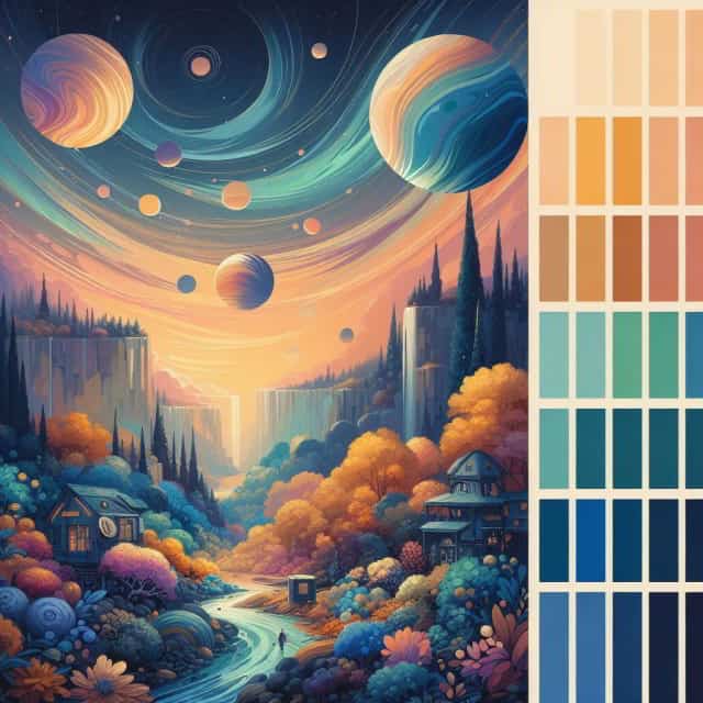
- Oceanic Blues: Evoking tranquility and serenity, oceanic blues transport us to expansive waters and endless horizons. Deep teals, virbant aquamarines, and calming shades of blue-green create a sense of calm and connection to nature.
- Digital Noir: A moody blend of deep reds, oranges, and black with metallics and neon flashes.
- Luxurious Neutrals: Beiges, taupes, and other warm colors with texture and natural materials.
- Pearlescence: Colors with iridescent gradients and holographic effects showing future worlds.
- Regal Hues: Deep purples, emerald greens, and rich blues that project luxury, heritage, and timeless elegance.
- Sharp Citrus: Vibrant yellows, oranges, and lime that add energy to the design.
Tips on Using the power of Color in your Design
- Balance Vibrancy with Contrast: While embracing bold colors, ensure adequate contrast for readability and visual clarity.
- Consider Accessibility: Select color palettes that accommodate individuals with visual impairments, adhering to WCAG guidelines. Contrast should generally be at least 7:1.
- Experiment with Color Combinations: Explore unexpected pairings and gradients to create unique and eye-catching designs.
- Align Colors with Brand Identity: Ensure colors are representative of your brand’s personality and message.
- Stay Updated on Evolving Trends: Stay ahead of the curve in color trends by reaerching continually evolving trends.
Unlocking the power of Color
By embracing the dynamic power of color, designers have the ability to craft visually stunning and emotionally resonant experiences. Remember that color is not merely an aesthetic choice – it’s a powerful tool for communication, engagement, and brand storytelling. The year of 2024 is the time for you to unleash the power of color for your brand.


