Think about it. When you land on a new website, what’s the first thing that truly grabs you? Before you even read a headline, you’re already getting a vibe, an impression. That instant gut feeling is almost entirely driven by color. It’s the silent workhorse that establishes the site’s entire mood, subtly guides your usability, and ultimately cements the brand’s identity in your mind.
While many designers play it safe, there’s a powerful tool for creating a look that is both dynamic and visually balanced: the triadic color scheme. Think of it as the secret to achieving that energetic “wow” factor without descending into visual chaos. It’s a favorite of mine for a reason—it just works.
So, in this guide, we’re going to pull back the curtain. I’ll walk you through a technical but practical exploration of what a triadic scheme actually is, dive into the psychological impact it has on your users, and show you precisely how to implement one to make your web designs truly stand out.
What is a Triadic Color Scheme? A Technical Definition

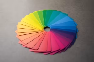
Before we can master the triad, we must first understand its foundation: the color wheel. This indispensable tool, first conceptualized by Sir Isaac Newton in the 17th century, organizes colors logically to show the relationship between them. It’s built from three tiers:
- Primary Colors: Red, Yellow, and Blue. These are the foundational colors from which all others are derived.
- Secondary Colors: Orange, Green, and Purple. These are created by mixing two primary colors.
- Tertiary Colors: These six colors are made by mixing a primary and a secondary color, resulting in shades like red-orange or blue-green.
Now, the triad. A triadic color scheme is formed by choosing three colors that are equidistant on this wheel, creating a perfect equilateral triangle. Imagine placing a triangle over the color wheel—the three points it touches form your palette. This geometric relationship is what gives the scheme its core characteristics: inherent vibrancy, high contrast, and a natural color harmony. In the digital world of web design, we define these precise colors using values like HEX codes (e.g., #FF5733) or RGB (e.g., rgb(255, 87, 51)) to ensure perfect accuracy.
How to Properly Use a Triadic Color Scheme: The 60-30-10 Rule

Here is where theory becomes practice. A triadic palette is energetic, and without a clear hierarchy, it can quickly become overwhelming. The key to taming this energy and achieving a professional, balanced design is a classic design principle: the 60-30-10 rule. It is non-negotiable for success with this scheme.
- 60% is your Dominant Color: This color will be the foundation of your design and occupy the most visual space. Think large background areas and the primary overall tone of the website. It sets the stage.
- 30% is your Secondary Color: This color supports the dominant hue and is used for elements that need to stand apart from the background. This is perfect for content cards, information panels, and secondary interactive elements.
- 10% is your Accent Color: This is the most vibrant of the three and should be used sparingly for maximum impact. Its job is to draw the user’s eye to the most critical elements: call-to-action (CTA) buttons, links, notification icons, and key highlights.
A pro tip: To add more sophistication, use tints (adding white), tones (adding gray), and shades (adding black) of your three core colors. This expands your palette, creating a richer user experience without breaking the fundamental harmony of the triad.
The Psychology of Triadic Palettes in UI/UX Design
Color is never just decoration; it’s a psychological signal. A triadic scheme communicates a very specific set of feelings. Its high-contrast, multi-hued nature creates an immediate sense of energy, dynamism, and youthful confidence. It feels active and stimulating, which can be incredibly effective for brands that want to appear innovative and full of life.
The challenge from a UI/UX design perspective is to harness that energy without creating visual stress. While an analogous scheme (colors next to each other on the wheel) feels calm and a complementary scheme (colors opposite each other) creates tension, a triad walks a fine line between the two. When balanced correctly with the 60-30-10 rule, it achieves a stimulating harmony that engages the user without fatiguing them.
Triadic vs. Other Common Color Schemes: A Comparison
Understanding how a triad differs from other schemes helps you know when to use it.
- Triadic vs. Complementary: A complementary scheme uses two colors directly opposite each other on the color wheel. It creates the highest possible contrast and tension but can be harsh. A triad diffuses that tension by adding a third, balancing color.
- Triadic vs. Analogous: An analogous scheme uses three colors that sit right next to each other. It’s incredibly harmonious and pleasing but lacks the contrast and “pop” of a triad. It’s safe, whereas a triad is bold.
- Triadic vs. Tetradic: A tetradic (or rectangular) scheme uses four colors—two complementary pairs. It offers the most color variety but is by far the most difficult to balance. A triad provides a more manageable, yet still vibrant, alternative.
What Are Good Examples of Triadic Color Schemes?

Not all triads are created equal; their feeling changes dramatically based on which colors you choose.
- Primary Triad (Red, Yellow, Blue): This is the most famous and boldest triad. It’s often associated with children’s brands, pop art, and companies that want to project simplicity and high energy. The classic Burger King branding is a prime example.
- Secondary Triad (Orange, Green, Purple): This combination is more sophisticated and often unexpected. It can create a look that feels both natural (from the green and orange) and luxurious (from the purple), making it great for creative agencies or modern tech brands.
- Tertiary Triad (e.g., Red-Orange, Yellow-Green, Blue-Violet): These triads are the most nuanced and unique. They create complex, fashion-forward palettes that feel fresh and contemporary. You might see these used by a design-centric startup or a modern fashion label.
Are Triadic Colors Good for Branding?
This is a critical question. The answer is a very direct: it depends on the brand’s personality.
Advantages: A triadic scheme is fantastic for creating a memorable and distinctive brand identity. It communicates confidence, creativity, and dynamism. Because the palette has a dominant, secondary, and accent color naturally built-in, it provides a versatile system for a brand to use across all its marketing materials.
Considerations: This scheme is not for everyone. For a brand that wants to communicate minimalism, serious authority, or traditional luxury (like a high-end law firm or a serene wellness spa), a triad can feel too loud and even unprofessional. It requires skillful application to avoid appearing chaotic.
Essential Tools for Building Triadic Palettes
You don’t need to guess. The digital age provides us with exceptional tools to build these palettes perfectly.
- Adobe Color: This is the industry standard. Its color wheel tool allows you to select “Triad” from the color harmony rules, and it will instantly generate a perfect palette that you can save and export.
- Coolors.co: A wonderfully fast and intuitive palette generator. You can press the spacebar to generate new palettes instantly and lock in colors you like while you search for others. It’s excellent for rapid exploration.
- Canva Color Palette Generator: A very user-friendly tool, especially for beginners. It can even extract a color palette from an image you upload, which can be a great source of inspiration.
Critical Factor: Accessibility and Triadic Schemes (WCAG)

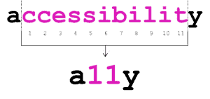
This is a point I cannot stress enough. A beautiful design that isn’t accessible is a failed design. While triads are vibrant, their very nature can create accessibility issues if you aren’t careful. The Web Content Accessibility Guidelines (WCAG) provide standards to ensure everyone, including users with visual impairments, can use the web.
The most critical factor here is color contrast. You must ensure that the contrast ratio between your text color and its background color is sufficient for readability. A light yellow text on a white background, for instance, would fail miserably. Always use a contrast checking tool during your design process to test your color combinations. A vibrant website aesthetic must never come at the expense of usability.
Conclusion: Mastering the Balance of the Triad
The triadic color scheme is a brilliant tool in any designer’s arsenal. It offers a perfect path to creating designs that are vibrant, compelling, and full of energy, without feeling chaotic. The key to unlocking its potential lies in respecting the principle of balance. By faithfully applying the 60-30-10 rule and always checking your work for accessibility, you can move beyond safe, predictable palettes. So go ahead—experiment with confidence and build something that truly captures attention.


