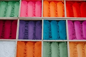
It is a well-documented principle in branding that a signature color can improve brand recognition by as much as 80%. This figure, while impressive, only hints at a deeper operational truth within the digital landscape. Color is not a passive, decorative layer applied to a wireframe; it functions as a primary and sophisticated language of its own. It operates beneath the surface of conscious thought, directly interfacing with user emotion, guiding behavior, and ultimately architecting the success—or failure—of a digital platform.
A systematic exploration of color psychology reveals the methodologies by which these emotional and behavioral responses can be strategically harnessed, allowing for the deliberate enhancement of the user experience (UX), the solidification of a coherent brand identity, and a measurable improvement in critical performance metrics, including conversion rates.
The Science of Sight and Feeling: Color Psychology in UX/UI

Before one can effectively apply color, one must understand the mechanisms through which it operates. The discipline of color psychology is the formal study of hues as a determinant of human behavior. It is not an abstract art but a field with roots in behavioral science. When light of a certain wavelength strikes the retina, it triggers a cascade of neurological signals that are processed not only in the visual cortex but also in regions associated with emotion and memory, such as the amygdala and hippocampus. This is why color is a cornerstone of user experience (UX) and emotional design; it bypasses rational thought to establish an immediate, visceral connection.
This subconscious processing is critical when considering initial brand perception. Research, including notable studies on the subject, indicates that users form a subconscious judgment about a website within 90 seconds of initial viewing. A significant portion of that assessment, estimated between 62% and 90%, is predicated on color alone. Therefore, a website’s palette is not merely an aesthetic choice but the primary variable in establishing feelings of trust, innovation, or urgency, directly impacting user engagement from the first moment of interaction.
A Chromatic Breakdown: The Emotional Profile of Key Colors
The emotional valence of a color is largely consistent, though it can be modulated by shade, tint, and cultural context. A systematic analysis is essential for strategic application.

Warm Colors: Energy, Passion, and Urgency
- Red (λ≈625−740 nm): The color with the longest wavelength, red is physically stimulating.
- Emotions: It evokes strong emotions such as passion, excitement, and energy. It is also evolutionarily linked to danger and importance, which translates digitally into urgency.
- Website Use: Red is a powerful accent color. It is highly effective for Calls-to-Action (CTAs) related to limited-time offers or sales (“Order Now,” “Buy Now”). Food and entertainment brands leverage it to stimulate appetite and excitement.
- Entity Example: The pervasive red of Coca-Cola associates the brand with energy and happiness, while YouTube uses it to signify play and action.
- Orange (λ≈590−625 nm): A blend of red’s energy and yellow’s optimism.
- Emotions: Orange communicates friendliness, enthusiasm, and confidence. It is less aggressive than red but still highly visible and energetic.
- Website Use: Ideal for CTAs that require user confidence, such as “Subscribe” or “Get Started.” It is favored by innovative and creative brands that wish to appear accessible.
- Entity Example: HubSpot uses orange to project a friendly, confident, and energetic brand personality.
- Yellow (λ≈570−590 nm): The most luminous color in the spectrum.
- Emotions: It is overwhelmingly associated with optimism, youth, and happiness. Its high visibility makes it excellent for grabbing attention.
- Website Use: Used to highlight critical information or to create a feeling of positivity. However, due to its brightness, excessive use can lead to visual fatigue.
- Entity Example: Snapchat’s yellow branding appeals directly to a youthful demographic, emphasizing fun and immediacy.

Cool Colors: Calm, Trust, and Nature
- Blue (λ≈450−495 nm): One of the most preferred colors across demographics.
- Emotions: Blue is the archetype of trust, security, stability, and professionalism. It has a calming effect, often associated with logic and communication. This is a primary reason it is considered the most trustworthy color in marketing.
- Website Use: Prevalent in corporate sectors, financial institutions, technology companies, and social media platforms to build user trust and project competence.
- Entity Example: Facebook, PayPal, and Dell all utilize blue to establish a foundation of security and reliability.
- Green (λ≈495−570 nm): The easiest color for the eye to process.
- Emotions: Green is dichotomously associated with nature (health, tranquility, growth) and finance (wealth, prosperity). It signifies balance and harmony.
- Website Use: Employed by brands in the environmental, health, and wellness sectors. In finance, it is used to signify positive growth. Its “go” signal also makes it a strong choice for primary CTAs.
- Entity Example: Spotify uses a vibrant green to feel fresh and alive, while Whole Foods Market uses it to underscore its connection to nature and health.
- Purple (λ≈380−450 nm): Historically associated with rarity and expense.
- Emotions: It communicates royalty, luxury, wisdom, and creativity. Lighter shades like lavender can be calming and sentimental.
- Website Use: Often found on websites for luxury goods, high-end beauty products, or services that wish to convey a sense of wisdom and imagination.
- Entity Example: Cadbury’s signature purple has created a powerful association with quality and indulgence for over a century.

Neutral Colors: Balance, Sophistication, and Foundation
- Black, White, and Grey: These are not colors in the spectral sense but are foundational to design.
- Emotions: Black signifies power, elegance, and sophistication. White denotes minimalism, cleanliness, and clarity. Grey represents neutrality, balance, and professionalism.
- Website Use: These neutrals provide the canvas upon which other colors act. All-black or all-white themes create powerful, modern aesthetics. Grey is often used for secondary text and background elements to reduce visual strain.
- Entity Example: Apple masterfully uses white, black, and grey to create a clean, sophisticated, and user-friendly aesthetic that lets the product be the hero.
Strategic Implementation: Building a High-Impact Color Palette
Theoretical knowledge must be translated into a functional system. A website’s color palette is an exercise in strategic balance and hierarchy.
- The 60-30-10 Rule: This is a classic design principle for creating a balanced color scheme.
- 60% Dominant Hue: This is your primary brand color, setting the overall tone of the site.
- 30% Secondary Color: This color should contrast with the dominant hue to create visual interest. It is often used for subheadings or secondary information blocks.
- 10% Accent Color: This is your most vibrant color, used sparingly to draw attention to key elements, most notably the call-to-action (CTA) buttons.
- Color for Conversion: The Psychology of CTAs: The effectiveness of a CTA button is directly tied to its visual prominence. This is explained by the Isolation Effect (also known as the Von Restorff effect), which posits that an item that stands out from its neighbors is more likely to be noticed and remembered. For a CTA, this means using a high-contrast accent color—often a warm, energetic one like orange or red—that is not used extensively elsewhere on the page. This singular focus guides the user’s eye and action, forming a key part of Conversion Rate Optimization (CRO).
- Testing and Iteration: No color theory can replace empirical data. The optimal color palette is contingent upon a specific audience and context. A/B testing, where two versions of a page with different color schemes are shown to different user segments, is the definitive method for determining which colors lead to higher engagement and conversions. Data must always supersede subjective preference.
Advanced Considerations: Accessibility and Cultural Context
A truly effective color strategy is both inclusive and globally aware.
- Color Across Cultures: The emotional meaning of color is not universal. For example, in Western cultures, white is associated with purity and weddings. In many Eastern cultures, it is the color of mourning. Red signifies luck in China but danger in South Africa. For global brands, conducting audience research to avoid negative cultural connotations is not optional; it is a requirement for market viability.
- Designing for All: Color and Web Accessibility: Design must serve every user, including those with visual impairments like color blindness. The Web Content Accessibility Guidelines (WCAG) provide a clear framework. The most critical standard is color contrast. For normal text (WCAG 2.0 Level AA), the contrast ratio between the text and its background must be at least 4.5:1. It is also a fundamental principle that color should never be the only means of conveying information (e.g., indicating an error with only a red outline). An icon, symbol, or text label must also be used.
Frequently Asked Questions (FAQ)

- Q1: How do colors affect emotions and behavior on a website?
- A: Colors trigger specific, often subconscious, psychological associations rooted in learned experience and evolutionary response. For instance, blue often evokes trust and calmness, making users feel more secure in providing information or making a purchase. Conversely, red can create a sense of urgency, compelling a user to act quickly on a sale. This strategic use of color effectively guides a user’s emotional journey and subsequent actions on a site.
- Q2: What is the best color combination for a website?
- A: There is no universally “best” combination, as the optimal choice is entirely dependent on the brand’s intended personality, its target audience, and its specific goals. However, a proven and effective framework is the 60-30-10 rule, which creates visual balance using a dominant color (60%), a secondary color (30%), and a high-contrast accent color for key actions (10%).
- Q3: What colors increase website conversion rates?
- A: While no single color guarantees conversions, high-contrast colors are most effective for Call-to-Action (CTA) elements. Energetic colors like orange, green, and red typically perform well because they create a strong visual distinction from the rest of the page, drawing the user’s eye. The most critical factor is not the color itself, but its contrast relative to the background and surrounding elements. The only way to determine the absolute best-performing color for your audience is through rigorous A/B testing.
Conclusion: Paint Your Website with Purpose
The emotional impact of colors on websites is a complex but manageable variable. Moving beyond simple aesthetic preference to a strategic, psychology-driven approach is what separates mediocre design from exceptional user experiences. By understanding the emotional valence of each hue and applying it within a structured, balanced, and accessible framework, color becomes one of the most powerful tools available for directing user perception, building brand equity, and achieving measurable business objectives. It is imperative to evaluate your digital presence not by the colors you like, but by the actions and feelings you intend to provoke.


