
In the world of digital design, color is often seen as the primary tool for capturing attention and expressing brand identity. A prevailing belief suggests that more color leads to a more dynamic and memorable user experience. However, a more considered approach reveals that the true power of color is unlocked not by its volume, but by its thoughtful application. This is where neutral colors enter the conversation, not as a safe or uninspired fallback, but as the most strategic and powerful element in a designer’s toolkit.
This article will deconstruct the fundamental benefits of employing a neutral-dominant palette in UI/UX design. We will examine how these seemingly simple colors are instrumental in enhancing usability, directing a user’s focus with surgical precision, and creating digital products that are scalable, accessible, and psychologically resonant with their audience.
The Foundation: What Constitutes a “Neutral” Color in UI/UX?

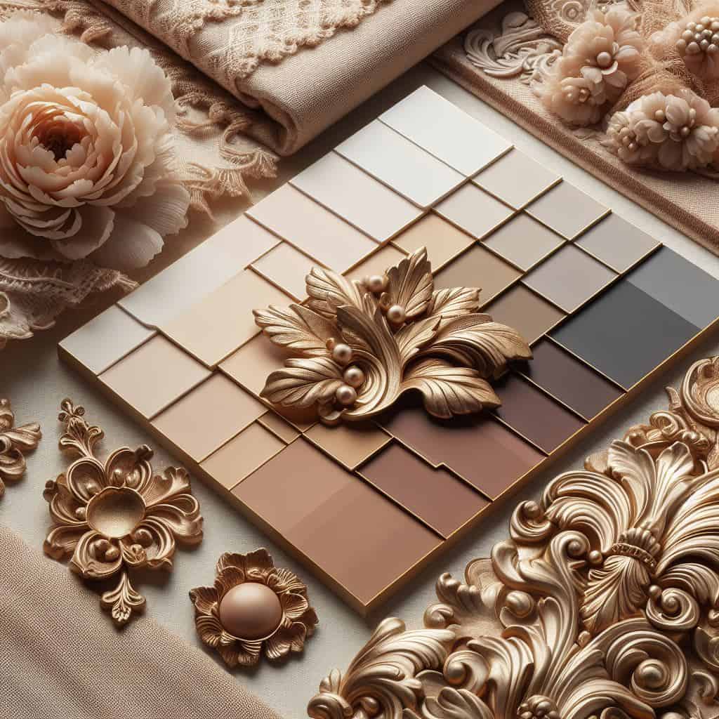
Before we can appreciate their benefits, it’s essential to understand what neutral colors truly are. When people hear “neutral,” they often picture beige, grey, or white. While that’s a good start, the concept is more technical and much more versatile. In color theory, a neutral color is one with very low saturation. Saturation is the intensity or purity of a color. A fire engine red is highly saturated, while a soft, dusty rose is low in saturation.
Neutral colors fall into two main categories:
- Achromatic Neutrals: The word “achromatic” simply means “without color.” These are your true neutrals: pure black, pure white, and all the shades of grey in between. They have no hue or color cast. Think of an old black-and-white photograph; it is composed entirely of achromatic neutrals. In UI design, these form the absolute bedrock of an interface, often used for text, the darkest backgrounds in dark mode, and the purest whites for light mode.
- Chromatic Neutrals: This is where the world of neutrals becomes rich and expressive. Chromatic neutrals are colors that have a very subtle hue or undertone. They appear neutral to the eye but contain a hint of color. Think of a warm, creamy off-white, a cool slate grey that has a touch of blue, a soft tan with a hint of yellow, or a sophisticated taupe that mixes grey and brown. These colors are the workhorses of modern design. They create mood and atmosphere without shouting. A warm neutral palette can make an app feel comforting and organic, while a cool neutral palette can make it feel crisp, modern, and tech-focused.
Understanding this distinction is key. A neutral palette isn’t just grey. It’s a family of low-saturation colors that work together to create a calm, organized, and supportive stage for your main content and interactive elements.
Core Benefit: Maximizing Legibility and Content Clarity

The single most important job of any user interface is to communicate information clearly. If a user cannot easily read the text or understand the content, the design has failed, no matter how beautiful it is. Neutral colors are the undisputed champions of legibility.
The reason for this comes down to a principle called luminance contrast. In simple terms, this is the difference in brightness between two colors—for example, the text and the background it sits on. The human eye reads text most easily when the contrast is high. The highest possible contrast is black text on a white background, which is why books have been printed this way for centuries. However, in the digital world it better to strike a balance between about 7:1 and 16:1 contrast to avoid eye strain; due to the light.
A neutral background provides the perfect, quiet canvas for text. It doesn’t compete with the letterforms for your eye’s attention. Imagine trying to read black text on a bright purple background. The background color is so vibrant that it creates a “visual vibration” that can make the text seem to shimmer or move, causing eye strain and making reading difficult. A neutral color, like a light grey or a soft beige, doesn’t do this. It sits quietly in the background, allowing the text to be the main focus.
To make sure websites and apps are usable for everyone, including people with visual impairments, there are global standards called the Web Content Accessibility Guidelines (WCAG). These guidelines provide specific rules for contrast. They give a score, called a contrast ratio, to measure how readable text is. For normal text, the minimum recommended ratio is . A neutral-dominant design makes it far easier for designers to meet and even exceed these critical accessibility standards, ensuring that their product is clear and usable for the widest possible audience.
UX Psychology: Reducing Cognitive Load and Enhancing Focus

Every element in a design—every color, button, and image—demands a small amount of a user’s mental energy. The total amount of brainpower needed to use a website or app is called cognitive load. When the cognitive load is too high, users become confused, overwhelmed, and frustrated. A major goal of good user experience (UX) design is to keep this load as low as possible.
Neutral colors are a powerful tool for reducing cognitive load. Think of it like the difference between walking into a chaotic, messy room with loud music playing versus walking into a clean, quiet library. In the messy room, your brain has to process dozens of competing things at once. It’s hard to focus on finding the one thing you’re looking for. In the library, the environment is calm and organized, making it easy to focus on your task.
A colorful, visually “loud” interface is like that messy room. Your brain has to process all the different colors while also trying to read the text, find the navigation, and understand the content. A neutral interface is like the library. By using a calm, neutral background, the design removes unnecessary visual noise. This frees up the user’s mental energy to focus on what really matters: completing their task, whether it’s buying a product, reading an article, or sending a message.
This ties into a well-known principle in UX called Hick’s Law, which states that the time it takes to make a decision increases with the number and complexity of choices. By reducing the number of strong visual signals (like bright colors), a neutral design simplifies the “choices” your eyes have to make, allowing you to move through the interface more quickly and efficiently.
The Power of Contrast: Making Accent Colors More Effective

Perhaps one of the most misunderstood aspects of using neutrals is the idea that it means having no color. The truth is that a neutral palette makes your important colors more powerful and more effective. These important splashes of color are called accent colors.
Think about a person wearing an entirely black outfit with a single, bright red scarf. Where do your eyes go immediately? To the scarf. The black outfit (the neutral) makes the red (the accent) pop. Now imagine that same red scarf on a person wearing a rainbow-colored shirt. The scarf gets lost in the visual noise.
The same principle applies directly to UI design. Your accent color should be reserved for the most important, actionable items on the screen: “Buy Now” buttons, links, notification icons, or “Add to Cart” buttons. When these elements are placed within a neutral interface, they instantly draw the user’s attention. The user knows exactly where to look and what to do.
A simple but effective guideline for this is the 60-30-10 Rule, which comes from interior design. It can be adapted for UI:
- 60% of your interface should be your primary, dominant neutral color (like a light grey for the main background).
- 30% should be a secondary neutral color (like a darker grey for content cards or a sidebar).
- 10% should be your key accent color (like a vibrant blue or green for all your buttons and links).
By following this balanced approach, you create a clear visual hierarchy. The neutrals build the structure and order, while the accent color provides the clear signposts that guide the user through the experience. Without the quiet support of neutrals, your accent colors would lose all their impact.
Building Trust and Sophistication: The Emotional Resonance of Neutrals

Colors are not just visual information; they carry emotional weight. While bright, saturated colors often convey energy, fun, and urgency, neutrals communicate a different, often more profound, set of emotions that are crucial for building user trust. The feelings associated with neutrals are often linked to the natural world—the colors of stone, sand, clouds, and wood. This creates a sense of stability and authenticity.
Different neutral palettes can be used to evoke specific feelings and support a brand’s identity:
- Whites and Light Greys: These palettes feel clean, simple, and honest. They create a sense of space and clarity. Tech companies like Apple have masterfully used this approach to make their products feel intuitive, modern, and user-friendly. It conveys a message of “we have nothing to hide.”
- Dark Greys and Charcoals: Often used in “dark mode,” these colors project a sense of sophistication, luxury, and focus. They are popular with entertainment apps (like streaming services) because they reduce glare in low-light environments and with financial or data-heavy applications because they feel serious, professional, and secure.
- Beiges, Creams, and Tans: These warm neutrals feel comforting, natural, and human. They are often used by wellness brands, high-end e-commerce sites, and lifestyle blogs to create a feeling of calm and quality. They feel less sterile than pure white and more inviting.
By choosing a neutral palette, a brand can communicate that it is competent, trustworthy, and sophisticated. It tells the user that the product is a serious tool designed for a specific purpose, creating a sense of calm and confidence that is essential for a positive user experience.
Practical Application: Constructing a Functional Neutral Palette
Moving from theory to practice, building a neutral palette is a systematic process. It’s not about randomly picking shades of grey. A functional palette is a small, versatile set of colors that can handle all your interface needs.
Here is a simple process for creating one:
- Choose a Base Background: This is your main canvas color, the one that will take up the most space. You might choose a slightly off-white (like
#F9F9F9) for a light theme or a very dark grey (like#121212) for a dark theme. Pure white (#FFFFFF) can sometimes cause eye strain, and pure black (#000000) can make text look too harsh, so slightly off-neutrals are often better.11 - Build Tints and Shades: From your base, you need to create variations for different UI elements.
- Surface Colors: Create a slightly darker or lighter neutral for elements that sit on top of the background, like content cards or pop-up modals. This creates a subtle sense of depth.
- Border and Line Colors: Create a more distinct neutral to be used for borders, dividers, and icons. This helps to separate different sections of the interface.
- Text Colors: You’ll need several neutrals for text. Don’t just use black. A very dark grey is often easier on the eyes. You’ll need a primary text color (high emphasis), a secondary color (medium emphasis for subtitles), and a light grey for disabled or placeholder text (low emphasis).
- Consider Temperature: Decide if you want a warm or cool palette. To create a warm palette, add a tiny hint of yellow or red to your greys and beiges. This will make the interface feel cozy and inviting. To create a cool palette, add a hint of blue. This will make the interface feel more modern, clean, and professional.
There are excellent online tools like Adobe Color and built-in features in design software like Figma and Sketch that can help you generate these variations and ensure they work well together. The goal is to have a small set of 5-7 neutral colors that can be used consistently across your entire application to create a sense of order and predictability.
Ensuring Longevity: The Timeless and Scalable Nature of Neutral Design
Design trends come and go. Remember the glossy “web 2.0” buttons of the late 2000s or the ultra-bright neons of a few years ago? A design that leans too heavily on a trendy color can look dated very quickly.
Neutral-dominant designs have a timeless quality.12 Just like a classic black dress, a simple white t-shirt, or a well-designed piece of wooden furniture, they don’t go out of style. This is a huge advantage for any digital product. A redesign is an expensive and time-consuming process. By building your interface on a timeless neutral foundation, you ensure that the product will still look modern and professional five or even ten years from now. You can update logos, illustrations, and accent colors to keep up with trends without having to rebuild the entire visual system from scratch.
This leads to the second benefit: scalability. “Scalable” means that the design can easily grow and expand over time. As a company adds new features, sections, and products, a neutral design system provides a stable and consistent framework. It’s easy to design a new screen because the rules for backgrounds, text, and containers are already established. The system is flexible. If marketing decides to change the primary brand color from blue to green, you only need to update the 10% accent color, not the entire 90% neutral foundation. This makes a neutral-based design system more efficient, easier to maintain, and less prone to inconsistencies as a product evolves.
Addressing a Common Objection: Are Neutral Interfaces Boring?
This is the most common criticism leveled against neutral design, and it stems from a fundamental misunderstanding. A boring design is not the result of a neutral palette; it is the result of poor execution. An unskilled designer can make any color palette look boring. A skilled designer can make a neutral palette feel elegant, engaging, and sophisticated.
The interest in a neutral interface comes not from the colors themselves, but from the masterful handling of other design fundamentals:
- Typography: A beautiful, well-chosen typeface with a clear size hierarchy can be more expressive than any color.
- Whitespace: Generous use of empty space (whitespace) around elements makes a design feel open, uncluttered, and luxurious. It allows content to breathe and directs the user’s eye.
- Layout and Grid: A strong, consistent grid creates a sense of order and rhythm that is deeply satisfying to the user.
- Subtle Details: Soft shadows can create a sense of depth, rounded corners can feel friendly, and high-quality imagery or illustrations can provide all the color and personality needed.
The famous German industrial designer Dieter Rams operated on the principle that “Good design is as little design as possible.” This means that good design doesn’t shout for attention; it gets out of the way and helps the user accomplish their goals. A neutral UI often perfectly embodies this philosophy. It’s confident enough to not need flashy colors to prove its worth. Its value is in its clarity, its ease of use, and its quiet, unobtrusive elegance.
Case Studies: Industry Leaders Mastering Neutral UI

To see these principles in action, we only need to look at some of the most successful and well-respected digital products in the world.
- Apple: Apple is perhaps the ultimate case study. Across their website and the iOS and macOS operating systems, the dominant aesthetic is built on a foundation of white, light grey, and dark grey. This does two things brilliantly. First, it creates an environment that feels clean, simple, and incredibly easy to navigate. Second, this neutral canvas makes their beautifully designed, colorful hardware products the absolute star of the show. The interface recedes into the background so the product can shine.
- Google (Material Design): Google’s design system, Material Design, is used across thousands of products. At its core is a highly systematic approach to neutrals. They have specific, named neutral colors for different “surfaces” at different elevations (e.g., the main background is one color, a card floating on top is slightly lighter). This creates a predictable and logical visual language that works at a massive scale. Their use of neutrals ensures that whether you’re in Gmail, Google Drive, or Google Calendar, the experience feels consistent and familiar.
Beyond tech, you can see this in other industries. High-fashion brands use minimalist, neutral websites to make their clothing and photography look more luxurious. Architectural firms use them to convey sophistication and let their project images tell the story. In every case, the neutrals aren’t a sign of a lack of creativity; they are a sign of a confident and strategic design choice.
Conclusion: Neutrals as a Cornerstone of Intentional Design
In the end, choosing to build a user interface on a neutral foundation is one of the most user-centric decisions a designer can make. It is a deliberate choice that prioritizes clarity over clutter, focus over distraction, and long-term stability over fleeting trends.
By leveraging a well-crafted neutral palette, you maximize readability and meet crucial accessibility standards. You lower the user’s cognitive load, helping them achieve their goals with less effort. You build a sense of trust and professionalism. And you create a timeless, scalable system while simultaneously making your key accent colors more powerful and effective.
So, the next time you approach a design, don’t think of neutrals as the absence of color. Think of them as the silent, supportive architecture that makes everything else possible. They are the cornerstone of intentional, mature, and truly exceptional user experience design.


