For most small business owners, data is a double edged sword. You know it’s important. You’ve been told that success is hidden somewhere inside those numbers on your Google Analytics reports. You might even spend time every week looking at charts showing website visitors, sales figures, and social media clicks. But if you’re honest, it often feels like you’re staring at a foreign language. The reports are generated, the numbers are there, but they don’t spark new ideas or inspire action. They’re just… data. This is a common and frustrating problem. The gap between having data and using it to make smart decisions is where many businesses get stuck.
The solution is a skill called data storytelling. Think of it as the bridge that connects the raw, confusing numbers to clear, confident business decisions. It’s the powerful ability to take your analytics reports and turn them from a static document into a compelling narrative that actually means something. This isn’t about being a math wizard; it’s about becoming a data translator.
This guide is your step by step framework to learn that skill. We will walk through what data storytelling really is, why it’s so critical for your business, and exactly how you can start doing it today. You’ll learn to find the hidden stories in your data and use them to drive real, measurable growth.
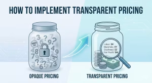
What is Data Storytelling? More Than Just Charts and Graphs

At its heart, data storytelling is the practice of building a story around a set of data to share a specific and useful insight. It’s not just about showing people a chart; it’s about explaining what that chart means and why it matters. Imagine you’re a detective at a crime scene. Just listing the clues you find—a footprint, a dropped key, an open window—doesn’t solve the case. You have to put those clues together in a sequence, explain how they connect, and build a story that leads to a conclusion. That is exactly what data storytelling does for your business data.
Many people confuse data storytelling with a few other terms, so let’s clear that up. It’s different from data reporting, which is simply presenting data. A report might say, “Website traffic went up 10% in May.” It’s a fact, but it’s a boring one. It doesn’t tell you anything about what to do next. It’s also different from data visualization, which is the act of creating charts and graphs. A beautiful bar chart is great, but without a story, it’s just a pretty picture. Data storytelling takes both of these elements—the report and the visual—and adds a crucial third ingredient: a narrative.
To master data storytelling, you need to understand its three core pillars:
- The Data: This is the foundation of your entire story. The data must be accurate, clean, and relevant to the question you’re trying to answer. If you start with bad data, you’ll end up with a bad story. This means pulling the right information from your analytics reports, whether it’s from Google Analytics, your sales system, or your email marketing platform. The integrity of your data is the most important first step in effective data storytelling.
- The Visuals: Humans are visual creatures. We can process images and patterns much faster than we can process rows of numbers in a spreadsheet. The visuals—the charts, graphs, and dashboards—are the medium you use to show your data. A good visual makes the key insight instantly obvious. For example, a line chart is perfect for showing a trend over time, while a pie chart is good for showing parts of a whole. Choosing the right visual is a key part of the data storytelling process.
- The Narrative: This is what ties everything together. The narrative is the story you tell about the data. It explains the context, shows the complication or conflict hidden in the numbers, and reveals the resolution or the action that needs to be taken. The narrative is what makes your data memorable and persuasive. Without a narrative, you just have facts. With a narrative, you have a powerful tool for communication. A strong data storytelling narrative can change minds and direct company strategy.
So, when you combine accurate data with clear visuals and a compelling narrative, you get true data storytelling. It’s a complete package that transforms your analytics from something that is merely seen into something that is truly understood and acted upon. This is the fundamental goal of all data storytelling efforts.
Why Data-Driven Narratives are a Competitive Advantage

In a crowded market, every small business is looking for an edge. You might think that edge comes from a better product or a clever marketing campaign. And while those things are important, one of the most powerful and overlooked advantages is the ability to use your own data effectively. When you master data storytelling, you unlock a competitive advantage that is incredibly difficult for others to copy. Here’s why it’s so important.
Stories Make Data Memorable
Think about the last presentation you sat through that was filled with slides of spreadsheets and bullet points. How much of it do you actually remember? Probably not much. Now, think about a great story you heard or a movie you watched. You likely remember the characters, the plot, and the key moments vividly. That’s because our brains are wired for stories. Stories create emotional connections and make information easier to recall.
When you present your business data as a story, the same thing happens. A narrative about “how our new customers from Instagram are struggling with the checkout page” is far more memorable than a metric that says, “The bounce rate for the /checkout page is 82% for the social referral segment.” Good data storytelling makes your insights stick with your team and your stakeholders, ensuring they remember what’s important long after the meeting is over.
They Drive Actionable Insights
One of the biggest problems with traditional data reports is that they often lead to a “so what?” reaction. You see a number, but you’re not sure what to do about it. Data storytelling solves this problem by design. A good data story always builds toward a conclusion and a recommended action. It doesn’t just show you what happened; it explains why it happened and tells you what you should do next.
For example, a data story might show that your blog traffic is high, but almost no one who reads the blog ever buys a product. The story would dig into the data to find the “why”—perhaps there are no clear links to product pages from the blog posts. The conclusion of the story isn’t just “blog readers don’t convert.” The conclusion is, “We need to add clear calls to action and product links within our top 10 blog posts to guide readers toward a purchase.” That is a clear, actionable insight that can directly lead to more sales. This focus on action is a hallmark of great data storytelling.
It Fosters a Data-Driven Culture
Many business owners want to build a “data-driven culture,” where everyone on the team uses data to make smart decisions. However, this is hard to do when data is locked away in complex reports that only a few people understand. Data storytelling makes data accessible and interesting to everyone, not just the analysts.
When a marketing manager can tell a clear story about which campaign is working and which isn’t, the whole team gets it. When a customer service lead can tell a story using data about the most common client complaint, the product development team knows exactly what to fix. By making data understandable and engaging through data storytelling, you empower your entire organization to think critically and use evidence to back up their ideas. This is how a truly data driven culture is born.
It Helps You Get Buy-In
Whether you’re a solo entrepreneur trying to convince a bank for a loan, or a manager trying to get a budget approved for a new project, you need to be able to persuade others. A spreadsheet full of numbers is rarely persuasive on its own. But a well told story backed by solid data? That’s incredibly convincing.
Imagine you want to invest in a new email marketing software. You could present a slide with a bunch of statistics about open rates and click through rates. Or, you could use data storytelling. You could tell a story about a specific segment of your customers who are slipping away, show data on how effective personalized emails are at winning back such customers, and conclude with a projection of the return on investment you expect from the new software. The second approach is far more likely to get you the “yes” you’re looking for because it connects the data directly to a business problem and a profitable solution. The art of data storytelling is the art of persuasion.
The Key Elements of a Powerful Data Story

Just like any good movie or book, a compelling data story has a few key ingredients that work together to capture the audience’s attention and deliver a powerful message. If you learn to identify and craft these elements, your data storytelling will become much more effective. Think of this as your recipe for turning boring data into an interesting and persuasive narrative.
The Big Idea
Before you even think about charts or slides, you need to know what your story is about. The Big Idea is the single, most important message you want your audience to take away. If they were to forget everything else you said, what is the one thing you want them to remember? You must be able to state this in a single, clear sentence.
For example, a Big Idea could be:
- “Our new shipping policy is frustrating our best customers and causing them to buy less.”
- “The marketing campaign we ran on Facebook was a huge success and brought in a new, highly profitable customer segment.”
- “Our website’s slow loading speed on mobile phones is costing us thousands of dollars in lost sales every month.”
Everything in your data story—every chart, every number, every word—should support this Big Idea. If a piece of data doesn’t help prove your main point, you should leave it out. A great data storytelling effort is focused and free of clutter.
The Setting (Context)
No story happens in a vacuum. The setting, or context, is the background information your audience needs to understand what’s going on. Without context, your data can be meaningless or even misleading. Context sets the stage for your story.
You need to answer a few basic questions:
- When? What time period are you looking at? (e.g., “This data is from the third quarter of this year.”)
- Who? Who are we talking about? (e.g., “We are focusing on first time visitors to our website.”)
- What was the goal? What were we trying to achieve? (e.g., “Our goal for the quarter was to increase online sales by 15%.”)
Providing this context at the beginning of your presentation helps your audience follow along and understand why the data you’re about to show them is important. Good data storytelling always begins with context.
The Characters (The Audience/Segments)
Every story needs characters. In data storytelling, your characters are usually your customers, users, or different segments of your audience. Giving your data a human face makes it much more relatable and interesting.
Instead of saying, “Segment B had a low conversion rate,” you could say, “Our young, mobile-only shoppers, the ones who find us on TikTok, are visiting our site but they almost never complete a purchase.” See the difference? Suddenly, we’re not talking about an abstract segment anymore; we’re talking about real people with real behaviors. This makes the problem more urgent and easier to understand. Thinking about your users as characters is a simple trick that dramatically improves your data storytelling.
The Plot (The Narrative Arc)
The plot is the structure of your story—the sequence of events that takes your audience from the beginning to the end. The most effective data stories follow a classic narrative arc, just like a movie.
- The Hook (The Beginning): You need to grab your audience’s attention right away. Start with the most surprising, shocking, or important finding. This is the mystery or the problem that needs to be solved. For example: “Last month, we spent more on marketing than ever before, but our sales actually went down. We need to figure out why.”
- The Rising Action (The Middle): This is where you build your case. You present the supporting data points and evidence that explore the problem. You show the different clues you’ve uncovered in your analytics reports. For example, you might show that while overall traffic went up, traffic from high converting channels like email went down. You could show that the new traffic from a different source had a very high bounce rate. Each piece of data adds another layer to the story. This is the core of your data storytelling analysis.
- The “Aha!” Moment (The Climax): This is the peak of your story, where you reveal the key insight. After presenting all your evidence, you connect the dots and explain the root cause of the problem. This is the moment where everything clicks into place for your audience. For example: “The reason our sales went down despite higher spending is that we shifted our budget to a new advertising platform that brought in a lot of clicks, but these visitors were not our target audience and had no intention of buying.”
The Ending (The Resolution)
Your story can’t just stop at the climax. You need to provide a resolution. What should happen next? Based on the insight you just revealed, what is your recommendation? A strong ending provides a clear path forward and tells your audience exactly what action they need to take.
For example, the resolution could be: “I recommend we immediately pause the new ad campaign and reallocate that budget back to our email marketing and organic SEO efforts, which have historically brought in our most valuable customers.” This ending leaves no room for confusion. It’s a direct and confident recommendation based on the story you’ve just told. This makes your data storytelling incredibly powerful and useful.
How to Build Your Narrative: A Step-by-Step Example

Theory is helpful, but seeing data storytelling in action is the best way to learn. Let’s walk through a realistic scenario for a small business to see how you can apply these principles.
The Scenario: Imagine you own a small online store called “Cozy Candles” that sells handmade candles. You’ve noticed that your sales have been flat for the past three months, even though you feel like you’re getting a decent amount of website traffic. It’s time to use data storytelling to figure out what’s going on.
Step 1: Start with a Question, Not with the Data
The biggest mistake people make is opening up Google Analytics and just randomly looking around. This is like wandering into a library without knowing what book you want to find. You’ll be overwhelmed and you won’t find what you need. Instead, you must start with a specific business question.
- A bad starting point: “Let’s see what the data says.”
- A good starting point: “Why have our sales been flat for three months even though our website traffic seems steady?”
This question gives you focus. It turns your data exploration into a mission. Your entire data storytelling process will be aimed at answering this single question.
Step 2: Gather the Right Data (The Clues)
Now that you have your question, you know what data to look for. For our Cozy Candles store, you would log into Google Analytics and start gathering clues. You’re not just downloading every report; you’re looking for specific pieces of information related to your question.
You might pull data for the last three months and compare it to the three months before that. You’d look at:
- Overall Sales (Revenue): To confirm that sales are indeed flat.
- Website Sessions (Traffic): To confirm that traffic is steady.
- Conversion Rate: This is a crucial metric. It tells you what percentage of your visitors are actually buying something.
- Traffic Sources: Where are your visitors coming from? (e.g., Google, Facebook, email, etc.)
- Device Category: Are people using desktops, tablets, or mobile phones?
- Audience Behavior: Which pages are they visiting? Where are they leaving your site (exit pages)?
This is the evidence gathering phase of your data storytelling.
Step 3: Find the Conflict and the “Aha!” Moment
As you look at the data, you start to piece together the story. You are looking for patterns, changes, or things that seem out of place. This is where the plot of your data story begins to form.
- The Hook: You confirm your initial suspicion. Your data shows that traffic has actually gone up slightly, but your total sales have stayed exactly the same. This is a puzzle. More visitors should mean more sales, but it doesn’t.
- The Rising Action: You dig deeper. You look at the e-commerce conversion rate and you find the first major clue: your conversion rate has dropped by 50%! This means you now need twice as many visitors to make a single sale. Now your question changes from “Why are sales flat?” to “Why did our conversion rate get cut in half?”You continue digging. You look at the conversion rate by device category. On desktops, the conversion rate is still strong and hasn’t changed much. But on mobile phones, the conversion rate has collapsed. It’s near zero. This is a huge clue.Finally, you look at your traffic sources. You see that most of your new traffic growth is coming from a recent series of Instagram promotions you’ve been running. And since most people use Instagram on their phones, this new traffic is almost entirely mobile.
- The “Aha!” Moment (The Climax): Now you can connect all the dots and reveal the core insight. You have found the answer to your question.The story is this: “Our sales are flat because a huge drop in our mobile conversion rate is canceling out all of our new traffic growth. We launched new Instagram ads that are successfully driving a lot of new, mobile-only visitors to our site. However, something is broken or extremely difficult about our mobile checkout process that is preventing these new visitors from buying anything. We are spending money on ads to bring people to a broken storefront.” This is the climax of your data storytelling.
Step 4: Craft the Narrative and Visualize It
Now you need to present this finding in a clear and compelling way. You wouldn’t just show someone the raw data. You would use data storytelling to present it as a narrative.
You could create a simple, two-slide presentation.
- Slide 1 Title: “The Mystery of Our Flat Sales: A Mobile Problem.”
- Visual 1: A simple line chart showing two lines over the last six months: one line for “Website Traffic” (trending up) and another for “Total Sales” (staying flat). This visual immediately shows the core problem.
- Slide 2 Title: “Our Mobile Storefront is Broken.”
- Visual 2: A bar chart comparing the conversion rate of “Desktop Users” vs. “Mobile Users.” The desktop bar would be high, and the mobile bar would be tiny. This visual pinpoints the exact source of the problem.
This simple visualization makes the conclusion of your data storytelling unavoidable.
Step 5: Propose the Resolution (The Ending)
The final, and most important, step is to recommend a solution. Your data story has identified a clear problem, so now you must propose a clear action.
Your recommendation would be: “We need to immediately pause our Instagram ads to stop wasting money. Then, our top priority must be to thoroughly test and fix our entire mobile shopping and checkout experience. Once it’s fixed, we can turn the ads back on and convert that traffic into sales.”
This is the power of data storytelling. You went from a vague feeling that “sales are flat” to a specific, evidence based action plan that will almost certainly fix the problem and grow the business.
Essential Tools for Effective Data Storytelling
While data storytelling is primarily a strategic skill, having the right tools can make the process much smoother and more powerful. These tools help you gather the data, visualize it effectively, and present your final narrative.33 Here’s a look at some of the essential tools that are perfect for small businesses.
Data Collection & Analytics
This is where your story begins. These tools are your source for the raw data you will use to uncover insights.
- Google Analytics: For any business with a website, Google Analytics is the indispensable starting point. It’s free, incredibly powerful, and provides a huge amount of data about who your website visitors are, where they came from, and what they do on your site. Learning how to navigate Google Analytics and pull basic reports on traffic, conversions, and audience behavior is the first technical skill you need for data storytelling.
- Adobe Analytics: This is an enterprise level alternative to Google Analytics. For most small businesses, it’s more powerful and more expensive than necessary. However, if your business grows to a larger scale with very complex tracking needs, it’s a major player in the analytics space.
- Your Own Business Data: Don’t forget the data you have in other systems! This includes your e-commerce platform (like Shopify or WooCommerce), your email marketing service (like Mailchimp or Constant Contact), and your customer relationship management (CRM) software. Combining this data with your website analytics often leads to the most powerful stories. For example, connecting marketing campaign data with actual sales data is crucial for any data storytelling about marketing ROI.
Data Visualization & Dashboards
Once you have your data, you need to display it in a way that’s easy to understand. These tools are designed to help you create clear charts, graphs, and interactive dashboards.
- Looker Studio (formerly Google Data Studio): This is the best friend of Google Analytics users. Looker Studio is a free tool that allows you to connect directly to your Google Analytics data (and many other sources) and create beautiful, shareable, and interactive dashboards. You can pull in your key metrics and build out the visuals for your data story all in one place. For a small business owner just getting started with data storytelling, this is the perfect tool to learn.
- Tableau: Tableau is one of the market leaders in data visualization. It is much more powerful than Looker Studio and can connect to almost any data source you can imagine. It allows you to create highly sophisticated and interactive visualizations. Tableau is not free and has a steeper learning curve, but if you find that data storytelling becomes a core part of your business strategy, investing time and money into learning Tableau can be incredibly valuable.
- Microsoft Power BI: This is Microsoft’s main competitor to Tableau. It is also an extremely powerful visualization tool. Its main advantage is its deep integration with the Microsoft ecosystem, especially Excel. If your business already runs heavily on Microsoft products and you are very comfortable with Excel, Power BI might be a more natural fit for you. It offers a free version for individual use, which is great for learning the ropes.
The most important thing to remember is that the tool is less important than the story. A simple, clear chart made in Looker Studio that tells a powerful story is far better than a dazzlingly complex dashboard in Tableau that doesn’t have a clear point. Start simple, focus on making your message clear, and let your data storytelling skills grow from there.
Conclusion: Your Data Has a Story to Tell. Are You Listening?
We’ve covered a lot of ground, but the message is simple: your business data is more than just a collection of numbers. Hidden within those analytics reports is a series of stories—stories about your customers, stories about what’s working, and stories about what’s broken. Data storytelling is the essential skill that allows you to find those stories, understand them, and use them to make smarter, faster, and more confident decisions.
It’s a shift in mindset from passively reporting on the past to actively shaping the future. It’s the difference between saying “our sales were $10,000 last month” and explaining “here is exactly how we can make our sales $15,000 next month, and here is the data that proves it will work.” This is not some complex technical skill reserved for data scientists. As we’ve seen, it’s a structured process of asking the right questions, finding the narrative arc, and communicating a clear message.
Don’t feel like you need to become an expert overnight. The journey into data storytelling begins with a single step. Start small. Pick one important business question you have right now. Use the framework we discussed to try and find the story in your data that answers it. Your first attempt may not be perfect, but it will be a start. With each story you build, you’ll get better, and soon you’ll find that you can’t imagine running your business any other way. The era of being intimidated by data is over. It’s time to become a data storyteller.