
Color is arguably the most evocative tool in a designer’s arsenal. It is a silent language that can guide a user’s eye, signal success or failure, evoke a specific emotion, and define the very identity of a brand. We build entire systems and user experiences around the assumption that a splash of red means “stop,” green means “go,” and a subtle shift in hue will be enough to differentiate critical pieces of data. Yet, the perception of this powerful tool is not universal. For a significant portion of the global population, this language of color can be ambiguous, confusing, or entirely illegible.
This gap in perception is caused by Color Vision Deficiency (CVD), a condition that affects approximately 1 in 12 men and 1 in 200 women worldwide. This is not a minor edge case to be dismissed; it represents a substantial user base that many digital products are unintentionally excluding. To create websites and applications that are truly effective, harmonious, and competent, a thorough understanding of accessible design principles is no longer an optional skill—it is a professional necessity. This guide provides a systematic framework, moving from the foundational science of color perception to the practical, everyday techniques required to build websites that are not only compliant but are genuinely usable and beautiful for everyone.
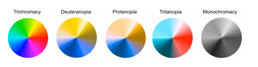
Understanding Color Vision Deficiency: Beyond “Red-Green” Blindness
Before we can design effective solutions, we must first have a precise understanding of the problem. The term “color blind” is often used as a blanket description, but it’s not very accurate. Most people with the condition can see color; they just have difficulty distinguishing between certain colors. A more precise term is Color Vision Deficiency, or CVD.
This happens because of a problem with the cone cells in the retina of the eye. We have three types of cone cells, and each one is responsible for detecting different wavelengths of light: red, green, and blue. When one or more of these cone types doesn’t function correctly, a person’s ability to perceive the full spectrum of color is altered. It’s less like seeing in black and white and more like viewing the world through a filter that makes some colors appear very similar to one another.
There are several primary types of CVD, each with a different impact on vision.
Deuteranopia & Deuteranomaly (Green-Weak/Blind)

This is the most common form of Color Vision Deficiency. It is caused by a problem with the green-detecting cone cells. In the case of deuteranopia, the green cones are missing entirely, while in deuteranomaly (the milder and more common version), the green cones are present but don’t function at 100%.
- What it looks like: People with this condition have the most trouble telling the difference between red and green. To them, a vibrant green lawn next to a red brick building might look like a collection of similar, muted brownish or yellowish tones. Shades of purple can also be difficult, as they might just look like blue because the red component of the color isn’t perceived correctly.
Protanopia & Protanomaly (Red-Weak/Blind)

This type of CVD is caused by a problem with the red-detecting cone cells. Similar to the green-weak condition, protanopia means the red cones are missing, and protanomaly means they are present but don’t work properly.
- What it looks like: This also causes difficulty in distinguishing between red and green. However, a key difference is that reds will appear much darker and less vibrant. A bright red stop sign might look like a dark, almost black shape. Oranges, yellows, and greens can all appear as similar shades of yellow. This can be particularly dangerous when color is used to signal a warning, as a bright red alert might not appear bright at all.
Tritanopia & Tritanomaly (Blue-Weak/Blind)

This is a much rarer form of CVD that involves the blue-detecting cone cells.
- What it looks like: People with this condition have trouble telling the difference between blue and green, and also between yellow and violet. The world might appear to them in shades of red, pink, and green. A bright blue sky might seem a pale green, and a yellow banana might look light pink.
Monochromacy (Achromatopsia)

This is an extremely rare condition where a person cannot perceive any color at all. They see the world in shades of gray, much like a black and white photograph. While it affects a very small number of people, designing for this condition reinforces the single most important lesson in accessible color design: you must always have a difference in brightness, not just a difference in color.
The key takeaway for any web designer or developer is this: the fundamental challenge for most users with CVD is not an inability to see color, but an inability to differentiate between certain color pairings. Our job is to make sure that our designs don’t force them to.
The Cornerstone of Accessible Design: WCAG and Contrast Ratios
If designing for CVD seems complicated, the good news is that there’s a clear set of rules to guide us. These rules were created by the World Wide Web Consortium (W3C), an international community that develops open standards to ensure the long-term growth of the Web. Their guidelines for accessibility are called the Web Content Accessibility Guidelines, or WCAG.
At the heart of WCAG’s guidance on color is a concept called the luminance contrast ratio. This sounds technical, but the idea is simple. It’s a measure of the difference in perceived brightness between two colors. It has nothing to do with the color’s name (like “red” or “blue”) and everything to do with how light or dark it is.
The ratio is written as a comparison, like .
- A ratio of means there is no contrast at all (like white text on a white background).
- A ratio of is the maximum possible contrast (black text on a white background).
The higher the first number, the easier it is to read the text or see the element. WCAG provides specific minimum contrast ratios that a design must meet to be considered accessible. There are two main levels of compliance designers aim for: AA and AAA.
WCAG AA Standard
This is the most common standard that websites strive to meet. It is considered a strong level of accessibility that is achievable for most designs.
- Normal Text: The contrast between the text and its background must be at least . This applies to most of the text on your website.
- Large Text: For text that is larger (defined as 18pt, or 14pt and bold), the requirement is a bit lower. The contrast must be at least . This is because larger, thicker text is naturally easier to read, so it doesn’t need quite as much contrast.
WCAG AAA Standard
This is the highest level of compliance and is often required for government websites or sites specifically designed for older audiences or users with low vision. It provides an enhanced level of accessibility.
- Normal Text: The contrast must be at least .
- Large Text: The contrast must be at least .
Adhering to these numbers is the single most effective thing you can do to make your website usable for people with CVD. Why? Because even if a user cannot tell the difference between the hue of your text and the hue of your background, a strong difference in their brightness will ensure the text is still perfectly legible. It makes your design robust. Furthermore, good contrast helps everyone, not just users with CVD. Anyone trying to read a website on their phone in bright sunlight or a user with age-related vision loss will benefit immensely from strong contrast.
Principle 1: Never Use Color as the Sole Conveyor of Information
If you remember only one rule from this entire guide, let it be this one. Information that is communicated using color must also be communicated in another way that does not rely on color perception. Relying only on color to tell a user something important is guaranteed to exclude people.
Let’s break this down with some common examples from around the web.
Example 1: Form Fields and Error Messages
- The Inaccessible Way: Imagine a user is filling out a sign-up form. They miss a required field and click “Submit.” The website’s only feedback is to turn the border of the empty input box red.
- Why It Fails: For a user with red-green CVD, that red border might look like a dark brown, which could be very similar to the default dark gray or black border. They might stare at the form, wondering why nothing is happening, completely unaware that the site is trying to signal an error.
- The Accessible Solution: Design the error state with multiple signals. Yes, you can still use a red border, but you must add more.
- Add an Icon: Place a small warning icon (like an exclamation mark in a circle) next to the input field. An icon is a shape, and its meaning is not dependent on color.
- Add Text: Display a clear, concise text message directly below the field, such as, “This field is required.”
This multi-signal approach is better for everyone. Now, a user not only knows that there is an error but also what the error is.
Example 2: Links Within Body Text
- The Inaccessible Way: A paragraph of black text contains a link that is styled to be blue, but it has no underline.
- Why It Fails: For someone who has trouble distinguishing blue from gray or other dark colors, that link might be completely invisible. They would have no way of knowing that a clickable piece of information is present.
- The Accessible Solution: Ensure that links have a non-color indicator. The most common and universally understood indicator is an underline. When a user sees colored and underlined text, they know instantly that it’s a link. On hover, you can remove the underline and add another indicator, but the default state should be clear without relying on color alone.
Example 3: Data Visualizations (Graphs and Charts)
- The Inaccessible Way: A pie chart represents five different data categories. The only way to know which slice corresponds to which category is to match the color of the slice to a color-coded legend on the side.
- Why It Fails: This is a nightmare scenario for a user with CVD. If two of the colors are red and green, the corresponding slices and legend items will look identical to them, making the entire chart impossible to interpret.
- The Accessible Solution: Don’t rely on a color-coded key.
- Use Direct Labels: Place the name of the category and its value directly on or next to its corresponding slice or bar.
- Use Patterns: Use different patterns or textures for each section. One slice could be solid, another could have diagonal stripes, another could have dots, and so on. This makes them distinguishable even in black and white.
Example 4: Buttons and Calls to Action (CTAs)
- The Inaccessible Way: You have two buttons side-by-side: a green one for “Accept” and a red one for “Decline.” They are identical in every other way.
- Why It Fails: A user with red-green CVD might see two buttons that are the exact same shade of brownish-yellow. They would have to guess which one does what, which could lead to frustrating or even costly mistakes.
- The Accessible Solution: Use multiple cues. Keep the colors if they are part of your brand, but add more information.
- Strong Text: Ensure the text inside the button is clear and unambiguous. “Accept” and “Decline” are good.
- Icons: Add a checkmark icon to the “Accept” button and an “X” icon to the “Decline” button.
- Styling: Make the primary action (e.g., “Accept”) a solid, filled-in button and the secondary action (“Decline”) an outlined button. This visual difference in weight and style provides a powerful clue that is independent of color.
Principle 2: Building and Testing an Accessible Color Palette
Many designers ask, “What is the best color palette for color blindness?” This question, while well-intentioned, is slightly flawed. There is no single magic palette that works for everyone. The better approach is to learn the principles for creating a robust and flexible palette that follows accessibility rules.
Avoid Problematic Color Combinations
Your first step is to be aware of the color pairings that cause the most trouble for people with the most common forms of CVD. As a general rule, avoid using these combinations for important, adjacent elements (like text on a background, or different bars in a chart):
- Red & Green
- Green & Brown
- Blue & Purple
- Green & Blue
- Light Green & Yellow
- Blue & Gray
- Green & Gray
This doesn’t mean you can never use these colors on your site. It just means they shouldn’t be the only thing differentiating two important pieces of information from each other.
Embrace Brightness Variation
A simple trick for building an accessible palette is to choose colors that have a wide variation in brightness. For example, a palette that includes a very light yellow, a medium blue, and a very dark gray is likely to be more successful than a palette with three mid-tone colors like green, orange, and red, which can have very similar brightness levels.
Palettes that are monochromatic (different shades of a single color) or analogous (colors that are next to each other on the color wheel) are often easier to make accessible because they naturally rely on changes in lightness and darkness rather than on different hues.
Essential Tools for Your Workflow
You don’t have to guess whether your colors are accessible. There are excellent, free tools available to do the hard work for you. Integrating these into your design process is non-negotiable.
- Palette Creation & Checking:
- Adobe Color: This powerful tool not only helps you create color palettes but has a dedicated “Accessibility Tools” tab. It will instantly show you if any of your chosen colors are too similar for the different types of CVD and will flag contrast issues.
- Coolors: Another popular palette generator that has built-in tools to simulate different types of CVD, allowing you to see your palette through the eyes of your users.
- Contrast Checking:
- WebAIM Contrast Checker: A simple and authoritative web tool. You input your foreground color (text) and your background color, and it instantly tells you the contrast ratio and whether it passes WCAG AA and AAA standards for normal and large text.
- Stark: A plugin that works directly inside design software like Figma, Sketch, and Adobe XD. This allows you to check contrast and run simulations without ever leaving your design file, making accessibility a seamless part of your workflow.
- Simulation:
- Coblis — Color Blindness Simulator: This website lets you upload an image of your design, and it will show you what that design looks like to someone with any of the different types of CVD. This is an incredible empathy tool that can instantly reveal problems that number-based checkers might miss.
- Browser Developer Tools: Most modern browsers, like Google Chrome, have built-in accessibility features. In Chrome’s Developer Tools, under the “Rendering” tab, you can emulate different vision deficiencies to see your live website as your users do.
A Practical Workflow for Implementation and Verification
Integrating these principles into your work doesn’t need to be complicated. Here is a simple, step-by-step workflow:
- Palette Selection: Begin by using a tool like Adobe Color to build a brand palette. Use its accessibility features to ensure your chosen colors don’t create obvious conflicts and have enough light/dark variation.
- UI Element Design: As you design your components (buttons, forms, links), consciously apply the principle of redundant cues. Ask yourself: “If this button were gray, would its meaning still be clear?” Add icons, text labels, and pattern variations.
- Contrast Auditing: As you design, use a contrast checker like the Stark plugin or the WebAIM website continuously. Check every single instance of text on a background. Check the contrast of icons against their background. Don’t wait until the end; do it as you go.
- Real-World Simulation: Once you have a key page or user flow designed, take a screenshot and run it through a simulator like Coblis. Better yet, use your browser’s built-in simulator to view the live page. Does the error state still stand out? Can you tell the active navigation item from the inactive ones?
- Iterate and Refine: Based on your audit and simulation, you will likely find areas for improvement. Perhaps a light gray text needs to be darkened. Maybe a chart needs patterns instead of just colors. Make these adjustments and test again.
Conclusion: Accessible Design is Simply Better Design
Designing for color vision deficiency is not about limiting your creativity or forcing you into a boring palette of black, white, and gray. It is about being a more thoughtful, competent, and effective designer. It is a creative challenge that forces you to communicate with more clarity and purpose.
The principles of accessible color design are, at their core, the principles of good design.
- Prioritize clarity and legibility with strong contrast.
- Communicate important information with multiple visual cues.
- Create strong visual hierarchy using size, space, and weight, not just color.
- Empathize with all your users by testing your work from different perspectives.
Ultimately, a website that is clear and easy to use for someone with Color Vision Deficiency is an exceptionally clear and usable website for absolutely everyone. It is the hallmark of professional, innovative, and truly harmonious design.
