In the digital landscape, where attention is the most valuable currency, a design’s first impression is often its last. Have you ever landed on a website and felt an immediate sense of harmony and clarity, where the most important elements seem to effortlessly draw your gaze? This isn’t an accident; it’s the result of a deliberate and masterful use of color. At the heart of many of these visually compelling experiences lies a foundational principle, one that leverages the dynamic tension between opposites.
These are complementary colors—pairs that sit directly across from one another on the color wheel, creating a vibrant and powerful interplay. Understanding how to harness this inherent contrast is key to transforming a simple layout into a memorable user journey. This exploration will serve as your guide, delving into the theory and strategic application of complementary colors to not only create stunning aesthetics but also to significantly enhance the overall user experience.
The Science Behind the Art: Understanding Color Theory

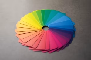
Before you can effectively apply color, you must first understand its language. The foundational tool for this is the color wheel, a circular diagram that illustrates the relationships between colors. Originally developed by Sir Isaac Newton in his studies on the spectrum of light, it remains an essential resource for designers.
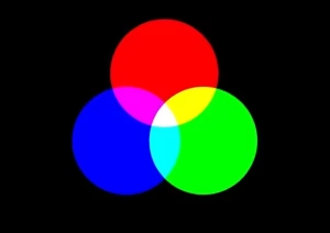
For digital purposes, we primarily work with the RGB (Red, Green, Blue) model, where these three colors are the primary building blocks. Mixing them creates secondary colors (cyan, magenta, yellow), and mixing those creates tertiary colors. In this model, colors that are directly opposite each other are complementary.
The classic complementary pairs are:
- Red & Green
- Blue & Orange
- Yellow & Purple
The power of these pairings comes from a phenomenon called simultaneous contrast. When placed next to each other, complementary colors make each other appear brighter and more intense. This high-contrast relationship is the secret to creating visual energy and drawing the user’s eye.
The Psychology of Color: Eliciting Emotion and Action

Color is a non-verbal language that speaks directly to our emotions. Using complementary pairs effectively allows you to combine these psychological effects to create a specific and powerful brand message.
- Blue & Orange: This is a favorite in the tech and corporate worlds. Blue conveys trust, security, and stability, while its complement, orange, brings energy, optimism, and friendliness. The combination feels both professional and approachable. Think of a bank website that uses a stable blue for its branding but orange for its “Sign Up” button.
- Red & Green: A vibrant and energetic pairing. Red signifies passion, excitement, and urgency, while green connects to nature, growth, and tranquility. This combination requires careful balance to avoid overwhelming the user or invoking holiday clichés.
- Yellow & Purple: This duo radiates creativity and sophistication. Yellow is associated with optimism, warmth, and intellect, while purple conveys luxury, creativity, and wisdom. It’s a fantastic choice for brands that want to appear both innovative and premium.
Beyond broad emotions, the high contrast of these pairs is a powerful tool for directing user attention. A strategically placed complementary color can make a call-to-action (CTA) button impossible to ignore, guiding the user’s journey through your site.
Practical Application: Using Complementary Colors Effectively

While the high contrast of complementary colors is their greatest strength, it can also be a challenge. The key is balance and moderation. A proven method for achieving this is the 60-30-10 Rule.
- 60% Dominant Hue: This is your primary color, setting the overall tone of the design.
- 30% Secondary Hue: This is the complementary color. It’s used to create contrast for key elements like headlines, subheadings, or secondary buttons.
- 10% Accent Color: This is often a neutral color (like white, grey, or black) or a variation of one of your main hues, used for minor details and text.
For a less intense but still dynamic look, consider using a split-complementary scheme. In this variation, you take a base color and pair it with the two colors adjacent to its direct complement. This provides strong visual contrast without the direct tension of a pure complementary pair.
Finally, remember that you aren’t limited to pure, fully saturated hues. Using tints (adding white), tones (adding grey), and shades (adding black) of your chosen colors will create a much more sophisticated and usable palette. A deep navy blue paired with a muted, burnt orange can be far more effective than a jarring royal blue and bright orange.
Common Pitfalls and How to Avoid Them
When handled poorly, complementary colors can harm a design more than they help. Here are the most common mistakes to avoid:
- Visual Vibration: Placing large blocks of two highly saturated complementary colors directly against each other can create a jarring, “vibrating” effect that is physically uncomfortable to look at. Always buffer them with a neutral color, like white space.
- Poor Readability: Never place complementary-colored text on a complementary-colored background without significant adjustments. For example, pure red text on a pure green background is nearly illegible. It’s a critical accessibility failure. Always check your text and background combinations with a contrast checker to ensure they meet Web Content Accessibility Guidelines (WCAG) standards.
- Lack of Hierarchy: Using both colors in equal measure creates chaos. Without a clear dominant color, the user’s eye doesn’t know where to focus. The 60-30-10 rule is your best defense against this, ensuring a clear visual hierarchy guides the user.
Tools of the Trade: Resources for Color Selection
You don’t have to rely on guesswork to build the perfect palette. A host of professional tools can help you explore, create, and test your color schemes.
- Palette Generators:
- Adobe Color: The industry standard, this powerful tool lets you apply various color harmony rules, including complementary and split-complementary, to a digital color wheel.
- Coolors: A fast, intuitive, and wildly popular tool for quickly generating and refining color palettes. You can lock in a color you like and hit the spacebar to see endless combinations.
- Contrast Checkers:
- WebAIM Contrast Checker: An essential resource for ensuring your design is accessible. Simply input your foreground and background colors to see if they pass WCAG standards for readability.
Inspiration Gallery: Websites That Master Complementary Colors
Let’s look at a few examples of complementary colors used effectively in the wild.
- Example 1: A Tech Startup (Blue & Orange): Imagine a homepage with a deep, trustworthy blue as the dominant background. The key headlines and the “Request a Demo” CTA are a vibrant, optimistic orange. The contrast makes the value proposition and the desired action immediately clear.
- Example 2: A Fashion Brand (Yellow & Purple): A luxury brand might use a muted, sophisticated lavender for its overall theme. A pop of bold, energetic yellow could be used for “New Arrival” banners or interactive elements, creating a feeling of modern elegance and excitement.
- Example 3: An Eco-Friendly Product (Red & Green): A site promoting sustainable goods might use a soft, earthy green as its base. Instead of a jarring pure red, it could use a desaturated, reddish-brown accent for buttons and links, creating a warm, natural, and trustworthy feel.
Your Questions, Answered
- How do you make complementary colors look good?The secret is balance. Don’t use them in equal amounts. Choose one to be dominant and use the other as an accent. Also, use tints, tones, and shades to create a more sophisticated palette instead of just using the pure hues.
- What is the most eye-catching color combination?While subjective, the high contrast of a blue and orange or yellow and purple pairing is inherently eye-catching due to the strong visual opposition. However, “eye-catching” should always serve the purpose of guiding the user, not just creating noise.
- Are complementary colors good for branding?Yes, they can be excellent for creating a memorable and dynamic brand identity. A complementary color scheme makes a brand feel confident and energetic. The key is to ensure the chosen pair’s psychological associations align with the brand’s intended personality and target audience.
Conclusion: Finding the Perfect Balance
The power of complementary colors is undeniable. They can infuse a design with energy, create a clear visual hierarchy, and guide a user toward a desired action. However, this power must be wielded with precision and purpose. By understanding the theory, respecting the psychology, and adhering to principles of balance and accessibility, you can move beyond simple color selection. You can begin to orchestrate a truly effective and emotionally resonant user experience, transforming your designs from merely functional to unforgettable.


