You’ve spent countless hours gathering the data. The insights are brilliant, but your report lands with a thud. The crucial message you worked so hard to uncover is buried, lost in a sea of numbers and text. It’s a deeply frustrating experience, knowing your content’s potential is being completely missed.
This disconnect doesn’t stem from your information’s quality but from its presentation. Many believe selecting an infographic is a simple matter of picking a chart. This is a fundamental misunderstanding. The most effective infographic isn’t chosen; it’s engineered. It is engineered to tell a specific story to a specific audience.
Before you even consider a bar graph versus a timeline, the foundational question must be answered: What is the single, core story you are trying to tell? Distilling your data into a potent, primary message is the critical first step. From there, you must consider who you are telling this story to. The right infographic acts as a bridge between your core message and your target audience, ensuring your narrative is not just seen, but understood and remembered. This guide will provide the framework to build that bridge.
A Taxonomy of Infographics: Matching Format to Function
Once you’ve defined your core message and audience, you can select the appropriate infographic format. The format is the vehicle for your story. Choosing the correct one is a matter of matching your primary goal to the infographic’s intrinsic function.

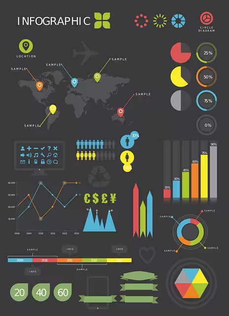
Statistical Infographics: Let the Numbers Talk
When your primary goal is to present data, survey results, or evidence from multiple sources, the statistical infographic is your most powerful tool. It’s designed to make data digestible and impactful. Rather than letting your numbers get lost in a paragraph, this format uses charts and graphs to bring them to the forefront.
- Best For: Showcasing data from market research, highlighting key figures from a report, or making a data-backed argument.
- Common Formats: Utilize bar graphs for direct comparisons, line graphs to show change over time, and pie charts (use with caution, best for simple compositions) to illustrate parts of a whole. The key is to use strong visuals, bold typography, and icons to make the statistics memorable.

Timeline Infographics: Charting a Course Through History
If your story is about a progression, a sequence of events, or a history, the timeline infographic is the optimal choice. It visually organizes information chronologically, making it easy for an audience to understand a series of events and the passage of time.
- Best For: Illustrating the history of a company or product, showing the evolution of an idea, or creating a project plan.
- Execution: Arrange events along a central line. Use icons, dates, and brief descriptions for each key milestone. This format excels at showing cause and effect or the development of a trend over a specific period.

Process Infographics: Simplifying Complexity
When you need to explain how something works, the process infographic (or “how-to” infographic) is your best asset. It breaks down a complex procedure into clear, numbered, or sequential steps that are easy to follow.
- Best For: Creating employee onboarding guides, explaining a customer journey, simplifying a scientific process, or providing a recipe.
- Execution: A top-to-bottom or left-to-right flow is most effective. Use numbering, arrows, and simple illustrations for each stage to guide the reader logically from start to finish. Clarity and simplicity are paramount.
Comparison Infographics: A Visual Face-Off
The comparison infographic is designed to help your audience make an informed decision by placing two or more options in a head-to-head analysis. It visually organizes information to highlight similarities and differences.
- Best For: Comparing two products (e.g., “iPhone vs. Android”), contrasting competing ideas or political candidates, or showing a “before and after” scenario.
- Execution: A split-screen layout, often divided by a central vertical line, is a classic approach. Use a consistent set of criteria on both sides to create a fair, one-to-one comparison that leads to a clear conclusion.
Hierarchical Infographics: Understanding Rank and Order
When your information involves levels, rankings, or a flow of command, the hierarchical infographic provides the necessary structure. It shows how different items or individuals are organized and related to one another within a system.
- Best For: Displaying an organizational chart for a company, illustrating Maslow’s hierarchy of needs, or showing a command chain.
- Execution: A pyramid or a flowchart are the most common structures. The most important or highest-ranking item is typically placed at the top, with subordinate elements branching out below it.

Geographic Infographics: Putting Data on the Map
For data that is location-dependent, the geographic infographic is the only logical choice. It uses maps as the primary visual element to display data, trends, and statistics related to specific regions.
- Best For: Showing election results by state, visualizing market penetration across a country, or comparing population density or disease outbreaks by region.
- Execution: Use heat maps (using color intensity to represent data values) or cartograms (distorting the size of regions based on a data point) to make your geographic data intuitive and visually striking.
Common Infographic Queries

These are some of the most common questions that arise when developing visual content. Addressing them is critical for building a foundational understanding.
What makes an infographic effective?
An effective infographic is a synthesis of three core elements: a clear story, data integrity, and competent design.
- Clarity & Story: It must have a single, focused narrative. If a viewer cannot understand the main takeaway in 5-10 seconds, the infographic has failed.
- Accuracy & Integrity: The data presented must be accurate, properly sourced, and presented without distortion. Misleading visuals erode trust and destroy credibility.
- Design & Aesthetics: It must be visually organized and pleasing. This involves a coherent color scheme, readable typography, a clear visual hierarchy that guides the eye, and sufficient white space to avoid a cluttered feel.
How do I create my own infographic?
You no longer need to be a professional graphic designer to create a basic infographic. There are many online tools available that offer templates and drag-and-drop interfaces.
- For Beginners: Tools like Canva and Piktochart are user-friendly and offer a vast library of templates and design assets. They are an excellent starting point for creating simple, clean visuals.
- For Professionals: Designers will typically use software like Adobe Illustrator for complete creative control, allowing them to build custom vector graphics from scratch.
What is the difference between data visualization and an infographic?
While the terms are often used interchangeably, they are not the same. Data visualization is the specific representation of data—a single chart or graph. For example, a bar chart showing Q3 sales is a data visualization.
An infographic is a complete piece of communication that uses one or more data visualizations, text, and images to tell a cohesive story. The infographic about Q3 sales might include the bar chart, but it would also have a title, introductory text, icons representing the products sold, and a conclusion explaining why sales performed that way. In short, data visualization is a tool; an infographic is the finished narrative.
Conclusion: From Information to Insight
Choosing the right infographic is not a superficial design choice; it is a strategic decision central to your communication’s success. By moving beyond the simple desire to “make something pretty” and focusing instead on the core tenets of storytelling, you transform your role from a mere presenter of information to a purveyor of insight.
The journey begins with a question: What story must I tell? From that foundation, you identify your audience and select the precise format—be it statistical, timeline, or process-based—that will carry your message most effectively. By respecting the principles of clear design and data integrity, you build a bridge between your complex data and your audience’s understanding. The result is an infographic that doesn’t just display facts but creates a lasting impact, turning passive viewers into an engaged, informed audience. Now, go build that bridge.