Have you ever noticed the arrow in the FedEx logo? For millions of people, it’s a logo they see every day on trucks, planes, and packages. Yet, a clever secret hides in plain sight, a perfect example of the many famous logos with hidden meanings all around us. Once you see it, you can never unsee it. This is not just a clever design trick. These hidden meanings are powerful, strategic business tools. They are deliberately crafted to communicate a brand’s most important ideas in a way that sticks in your mind.
Many of the world’s most recognizable brand marks contain these secrets. They are designed to create a moment of discovery for the customer, a small “aha!” that builds a surprisingly strong connection. In this article, we will pull back the curtain on these brilliant designs. We will explore the psychology that makes them so effective and look at the design techniques used to create them. We will then deconstruct some of the most famous logos with hidden meanings, revealing the stories and strategies they hold. Finally, we will provide clear, actionable insights for any business owner looking to create a more powerful and meaningful brand identity. Get ready to see the world of branding in a whole new way.
The Psychology of Discovery: Why Hidden Meanings in Logos are Effective
Why do companies go through the trouble of embedding hidden meanings in their logos? The answer lies in simple human psychology. Our brains are wired to find patterns and solve puzzles. When we discover something on our own, it feels like a personal achievement, and that feeling creates a powerful and positive memory. This is the core reason why logos with hidden meanings are such an effective marketing tool.
The “Aha!” Moment is a key part of this process. Think about the feeling you get when you finally solve a riddle or see the image in an optical illusion. That spark of understanding is satisfying. When a customer discovers one of the hidden meanings in a company’s logo, they experience that same spark. It makes them feel clever and in-the-know. This positive emotion becomes directly associated with the brand, creating a bond that is much stronger than if the message were simply spelled out. These hidden meanings transform a passive viewer into an active participant in the brand’s story.
This leads directly to enhanced brand storytelling. A logo is often the first thing a customer sees. It has to communicate a lot of information in a very small space. Simple hidden meanings can tell a complex story very quickly. The smile in the Amazon logo, for example, tells a story of customer satisfaction. The arrow also pointing from A to Z tells a story about the huge variety of products they sell. Trying to say all that in words would be clumsy. By using hidden meanings, brands can pack deep and important ideas into a clean and simple design. It allows them to communicate their core values without saying a single word.
Logos with hidden meanings are also far more memorable and shareable. When you discover one of these secrets, what is the first thing you want to do? You want to tell someone. You might turn to the person next to you and say, “Did you know about the arrow in the FedEx logo?” This is word-of-mouth marketing at its finest. People love sharing secrets and interesting facts. The hidden meanings in a logo give them a great reason to talk about a brand. This makes the logo stickier in the public’s memory. The element of surprise acts as a powerful hook that keeps the brand top of mind. This organic sharing is something that money simply cannot buy.
Finally, these logos are masters at communicating a dual message. On the surface, the logo is simple, clean, and professional. It works perfectly for its main job of identifying the company. But underneath, for those who look a little closer, there is a second layer of communication. This rewards customers for paying attention. It suggests that the brand itself is thoughtful, clever, and pays attention to detail. The simple surface message is for everyone, but the hidden meanings are a special reward for the engaged customer. This approach allows a brand to appear both straightforward and intelligent at the same time, which is a very powerful combination.
Key Design Techniques for Creating Subliminal Messages

Creating logos with hidden meanings is a true art form that requires both creativity and technical skill. Designers use several core techniques to embed these secret messages into a brand’s identity. Understanding these techniques helps you appreciate the genius behind these famous logos and can inspire you when thinking about your own branding. These methods are the tools a designer uses to build hidden meanings that connect with an audience.
Negative Space
One of the most popular and celebrated techniques is the use of negative space. Negative space is simply the empty or blank space that surrounds an object in an image. Talented designers do not see this space as empty. Instead, they see it as an opportunity. They shape this “empty” space to form a second image, one that reveals one of the logo’s hidden meanings.
The FedEx logo is the masterclass in using negative space. The space between the uppercase “E” and the lowercase “x” is carefully shaped to form a perfect arrow. This arrow is not part of the letters themselves; it exists only in the space between them. This is what makes it so subtle and so brilliant. The arrow instantly communicates ideas of speed, direction, and precision, all core values for a delivery company. Using negative space to create hidden meanings shows a high level of design skill and results in a logo that is both simple and deeply intelligent.
Symbolism and Double Entendre
Symbolism is another powerful tool for creating hidden meanings. This technique uses images or shapes that represent a bigger idea. A heart shape, for example, symbolizes love and care. Designers use symbolism to connect a brand to a specific concept or emotion. A double entendre takes this a step further by using a shape that has two meanings at the same time. This is a very efficient way to pack multiple messages into a single design.
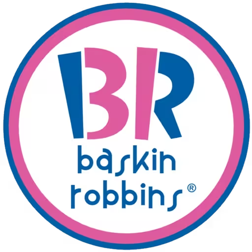
A great example is the Baskin-Robbins logo. At first glance, you see the initials “BR”. But if you look at the pink parts of the letters, you will see the number “31”. This number is a core part of the company’s history. It represents their famous promise of offering 31 different flavors of ice cream, one for every day of the month. The logo uses a double entendre. The shapes are both letters and numbers. This clever use of hidden meanings communicates the brand’s unique identity and heritage in a fun and playful way.
Typographic Manipulation
The third key technique is typographic manipulation. This involves altering the letters and words themselves to create images or convey a message beyond the literal text. Designers can stretch, cut, or combine letters to embed hidden meanings directly into the company’s name. This method is very effective because the brand name is usually the most prominent part of a logo.
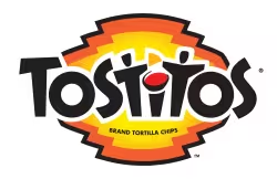
The Tostitos logo is a fantastic example of this. At first glance, it just looks like the brand name in a festive font. But look closely at the center. The two “t” letters are designed to look like people, and the dot on the letter “i” is a bowl of salsa. Together, they create a small scene of two people sharing chips and salsa. This brilliant typographic choice does more than just spell the company’s name. It visually represents the idea of friendship, sharing, and fun, which is exactly how the company wants you to think about their product. These subtle hidden meanings turn a simple word into a story about human connection.
Case Studies: Famous Logos with Hidden Meanings Deconstructed
Now that we understand the why and the how, let’s dive into some more famous examples. Seeing these techniques in action is the best way to appreciate the level of thought that goes into creating a world class brand identity. Each of these logos uses hidden meanings to tell a unique story and create a lasting impression.
Mastery of Negative Space
As we discussed, using the empty space in a design is a sign of true mastery. These brands have used it to create some of the most memorable hidden meanings in the branding world.
FedEx

We have to start with the king of all logos with hidden meanings: FedEx. Designed in 1994 by Lindon Leader and his team, the logo’s primary goal was to appear professional and reliable. The bold, simple lettering achieves this perfectly. But the true genius is the hidden arrow. Leader explained that he wanted the logo to have a hidden, positive element. The arrow, formed by the negative space between the “E” and “x,” was the perfect solution.
The designer’s intent was to subconsciously associate the brand with its key values. An arrow universally represents speed, forward movement, direction, and purpose. For a logistics company that promises to get your package from one point to another quickly and accurately, there could be no better symbol. The impact of this logo is immense. Once people discover the arrow, they feel a sense of connection to the brand’s cleverness. It has won over 40 design awards and is often cited as one of the best designs of the modern era. The hidden meanings in the FedEx logo are a perfect example of form and function working together.
Goodwill

Goodwill is a non-profit organization known for its thrift stores and community programs. Their logo, a stylized smiling face, seems straightforward enough. It effectively communicates the positive impact the organization has on people’s lives, or the good feeling you get from donating or finding a bargain. But this logo also has a clever secret.
Look at the letter “g” in the word “Goodwill” below the main image. You will notice that the smiling face is actually just a larger, cropped version of that same lowercase “g”. The hidden meanings here work to unify the brand’s identity. The symbol and the name are visually linked, reinforcing each other. This shows a thoughtful design process that connects the feeling of “goodwill” (the smiling face) directly with the name of the organization. It is a subtle touch, but it makes the branding more cohesive and memorable. It’s a message of happiness embedded in the very letters of their name.
Clever Symbolism and Brand Storytelling
Symbols can tell stories much faster than words. These companies use clever shapes and symbols to communicate their history, their products, and their entire philosophy through hidden meanings.
Amazon

The Amazon logo is one of the most recognized in the world today. It seems simple: the company name with a bright orange arrow underneath. But that arrow is doing a lot of work. First, it is clearly a smile. This was intentional. Amazon wanted to represent their focus on customer satisfaction. The smile suggests a happy and easy shopping experience.
But the arrow has a second, equally important job. It starts at the letter “A” and points to the letter “Z”. This is a brilliant and simple way to communicate the brand’s core business proposition: they sell everything, from A to Z. This was especially important in the company’s early days when they were trying to establish themselves as more than just an online bookstore. These dual hidden meanings are incredibly efficient. In one simple graphic, Amazon tells a story of customer happiness and endless selection. It’s a perfect visual summary of their brand promise.
Baskin-Robbins

As mentioned earlier, the Baskin-Robbins logo is a playful example of hidden meanings in branding. The company was founded on the idea of offering a new ice cream flavor for every day of the month, totaling 31 flavors. This number became a huge part of their identity and marketing. When they redesigned their logo in 2005, they wanted to honor that history in a modern way.
The designers cleverly hid the number “31” in the initials of the company name. The pink parts of the “B” form the number “3,” and the pink part of the “R” forms the number “1.” This design is so successful because it operates on two levels. For those who don’t know the story, it’s just a fun, colorful logo. But for those who know the brand’s history, spotting the hidden meanings feels like being part of an exclusive club. It rewards longtime customers and serves as a great story to tell new ones. It keeps their founding principle alive in every cup and cone they sell.
Toblerone

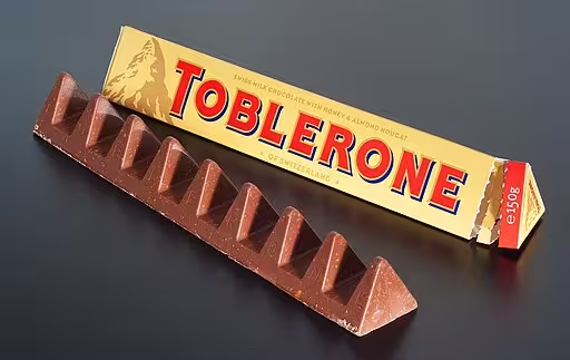
The Toblerone chocolate bar is famous for its unique triangular shape, which is meant to represent the Matterhorn mountain in the Swiss Alps. The mountain peak is featured prominently in their logo. But there is another secret hiding on that snowy peak. If you look closely at the shading on the mountain, you will see the outline of a bear standing on its hind legs.
This bear is not random. The hidden meanings here pay tribute to the brand’s origins. Toblerone was created in Bern, Switzerland. Bern is famously known as “The City of Bears,” and a bear is featured on its official coat of arms. By hiding the bear in the mountain, the company is embedding its heritage directly into its logo. It’s a nod to their roots and a symbol of their authentic Swiss quality. It’s a detail that most people miss, but it adds a layer of rich history and local pride to the brand.
Ingenious Typographic Illusions
Sometimes, the best place to hide a message is within the letters themselves. This technique of typographic manipulation creates surprising and delightful hidden meanings that are seamlessly integrated into the brand name.
Tostitos

The Tostitos logo is a masterclass in creating a sense of fun and community. The design of the wordmark is bright and festive, which is perfect for a brand of tortilla chips and salsa often associated with parties and gatherings. The real magic, however, happens in the middle of the word.
The two lowercase “t”s are stylized to look like abstract figures of people. The dot over the “i” is transformed into a bowl of red salsa. The entire composition creates a mini-drama: two people coming together to share a snack. The hidden meanings are clear and powerful. Tostitos are not just a solo snack; they are a food meant for sharing. This logo visually communicates the ideas of togetherness, celebration, and human connection. It plants a positive image in your mind every time you look at the bag, suggesting that buying their product will lead to happy, social moments.
Gillette

Gillette is a brand built on the concepts of sharpness, precision, and a close shave. Their logo, which is simply their name in a bold, italicized font, needed to reflect these qualities. The designers achieved this with an incredibly subtle but effective typographic trick.
Look closely at the first two letters, “G” and “i”. You will see that a small portion of each letter has been perfectly sliced away with razor-like precision. The diagonal cut across the top of the “G” flows perfectly into the dot of the “i”. This razor sharp cut is one of the more subtle hidden meanings on this list, but it’s incredibly effective. It visually represents the action of the product itself. The clean, sharp slice conveys a sense of high performance and quality. It subconsciously tells the customer that Gillette razors are so sharp and precise, they can even cut through steel-like letterforms.
Applying These Principles to Your Small Business Logo
Seeing how global giants use hidden meanings is inspiring, but these principles are not just for big corporations. Small businesses can and should use these same ideas to build a stronger local brand. A thoughtful logo can make your business look more professional and help you stand out from the competition. Using hidden meanings can give your brand a memorable story that local customers will connect with.
Start with Strategy, Not Just Art
The first and most important step is to think about your brand’s strategy. A logo is not just a pretty picture; it is a communication tool. Before you ever talk to a designer or try to sketch something yourself, you need to answer some key questions:
- What is the single most important idea my business stands for? (e.g., quality, speed, community, tradition)
- What makes my business unique compared to my local competitors?
- What feeling do I want my customers to have when they see my brand? (e.g., trust, excitement, comfort)
Your answers to these questions will form the strategic foundation for your logo. Any hidden meanings you decide to include should directly support these core ideas. For example, a local coffee shop focused on being a community hub might try to incorporate a subtle image of two people talking into their coffee cup logo.
Briefing a Designer
Once you have your strategy, you can effectively communicate your vision to a graphic designer. A professional designer can help you brainstorm clever ways to incorporate hidden meanings into your logo. Give them your strategic answers from the previous step. Be clear about your core message. Don’t just say “I need a logo.” Instead, say “I need a logo for my bakery that communicates a feeling of homemade tradition and family.” This gives the designer a clear direction. They can then explore ideas, like using a rolling pin to form the letter “L” in your business name, or hiding a small heart in the steam rising from a pie.
Subtlety is Key
A common mistake is trying to make hidden meanings too complex or too obvious. The most effective examples are subtle. The primary logo must be strong enough to stand on its own. It needs to be clear, readable, and easily recognizable. The hidden element should be a bonus, a reward for the observant customer. If the secret message makes the logo confusing or hard to read, it is not working. The goal is to create a delightful surprise, not a frustrating puzzle. The best logos with hidden meanings work perfectly even if you never spot the secret.
Relevance to Local SEO
You might wonder how a logo connects to something like local search engine optimization (SEO). The connection is through brand recognition and trust. When people search for local services, they are presented with a list of options. A strong, professional, and memorable logo will stand out on a search results page or in a local directory like Google Maps.
If a customer has seen your memorable logo on a truck, on a sign, or in a local ad, they are more likely to recognize it and click on your business in the search results. A clever logo with a story is more likely to be remembered. That recognition builds trust, and trust leads to more clicks, more calls, and more foot traffic. Your logo is the visual face of your business everywhere it appears, both online and off. Making it meaningful and memorable is a smart investment in your local visibility.
Frequently Asked Questions (FAQ)
Q: What is the most famous logo with a hidden meaning?
A: The FedEx logo is widely considered the most famous example. Its hidden arrow, formed by the negative space between the “E” and “x,” is celebrated in the design community for perfectly symbolizing the company’s focus on speed and direction in a subtle and brilliant way.
Q: What is the purpose of negative space in a logo?
A: The purpose of negative space is to use the “empty” or background area of a design to create a second, hidden image. This clever technique adds a deeper layer of meaning to the brand’s identity. It often surprises and delights the viewer upon discovery, making the logo more memorable and intelligent.
Q: How can a hidden message benefit a brand?
A: A hidden message benefits a brand in several ways. It creates a memorable “aha!” moment for the consumer, which builds a positive emotional connection. It also strengthens brand storytelling by communicating core values visually. Finally, it makes the logo more shareable, encouraging word-of-mouth marketing as people tell others about the secret they found.
Conclusion: More Than Meets the Eye
From the forward-moving arrow of FedEx to the communal chip-dipping of Tostitos, it is clear that the world’s best logos operate on more than one level. They are more than just pretty designs; they are intricate pieces of visual communication, packed with stories, values, and promises. These logos use the psychology of discovery and clever design techniques to forge a connection with us that is both emotional and intellectual. The hidden meanings they contain transform them from simple corporate marks into engaging puzzles that delight us when we solve them.
A logo is the face of a business. It is the silent ambassador that speaks to customers in an instant. A logo with hidden meanings gives that face a unique personality and a compelling story to tell. It suggests a brand that is thoughtful, intelligent, and cares about the details. As we have seen, this is a powerful message for any business, big or small, to send.
What are some of your favorite logos with hidden meanings? Share them in the comments below!


